
Lyndsay Adler Portraiture / Experimenting With Colour

|
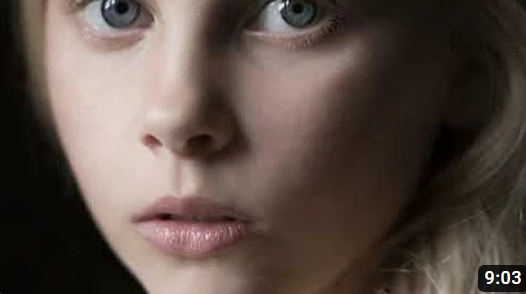
"Shoot what you like to be hired for" Who is she?Lyndsay Adler is a photographer and author based in New York who focuses on portraiture images and is well known for her fashion editorials but also as a teacher of photography. She is an educator because she believes that my helping others grow, she herself can learn and improve in her work. She calls herself a 'visual problem solver' as she is driven by the challenge of creating the perfect atmosphere for a shoot and producing the best images. This helps her to enjoy every part of her work and product and allows her to push boundaries in the visual world.
|
What is she inspire by?
She is inspired my movies and museums but also by the people round her. In all her work she thrives to portray herself as a strong. professional woman, making sue that all of her work positively reflects her and all women rather than using them, as a sexual focus of art. She is able to display things on or around her model which push more of a feminine style but that in no way actually reflects the strong woman the model portrays. She is also inspired by the people that she teaches as they help her also learn and grow as a photographer despite her being the educator, so her work is constantly evolving for the better.


Lyndsay Adler / Colour Gels and Reflection

|
Here, Lyndsay Adler has used the techniques of colours gels and reflection to portray a story and create a setting. Colour gels are coloured sheets of plastic which are put on the lighting , in this case she used 3 strobe lights all at different angles, so that there is coloured light displayed on the model. In these images we can see she uses a mix of teal and magenta, while also using a normal light to create contrast and prevent abstracting the model. For the reflection aspect she has used a mirror which the model looks into, interacting with her model. For the 'night rain' effect, she sprayed water on the mirror and gave the model a wet makeup look and hairstyle, so that the two aspects blend
|
together. The makeup look is also dark so that that the features of the model are sharp but not distracting, and it complements the background while contrasting the colour gels. The images were take from close behind the model and below, although this one seems to be from straight on, so that we can see the model looking up at her reflection, and also get more of her sharp features. Here she is trying to make the model look mysterious and dramatic while also making sure to demonstrate her elegance as a women and in these images you can clearly see that the subject is admiring her beauty, and she is feeling her power. This is helped by the moody lighting and they all highlight the elements of colour, harmony, symmetry and contrast.
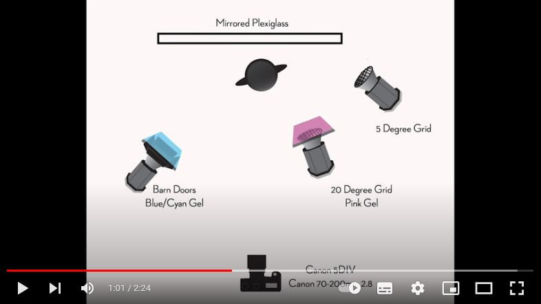
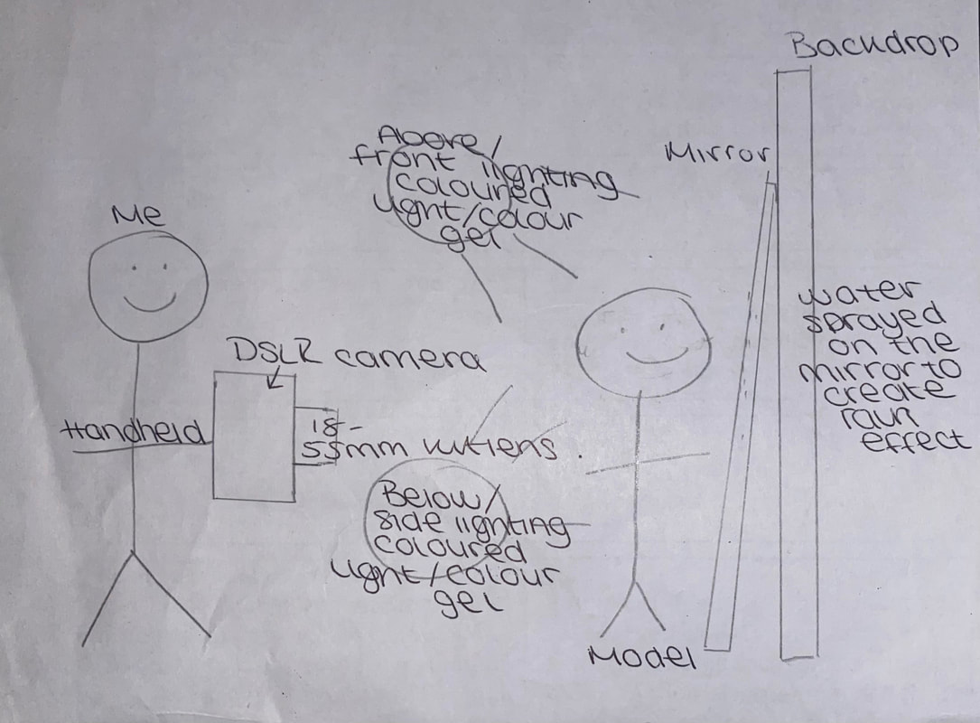
This is her shoot plan diagram which displays the lighting and its position, the placement of the mirror and model, and where shell shoot with what camera. This was clearly moved throughout the shoot to allow her to be more dynamic and have more variety in her final images.
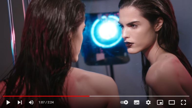
The model is positioned in a strong pose, interacting with her reflection. She also has dark looking makeup to reinforce the idea of her strong femininity but also to complement the dark lights while not distracting. She has slicked back wet hair to blend what is meant to be outside ,with the rain, and inside.
|
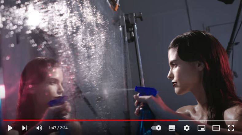
Here demonstrates how she created her 'night rain' effect by spraying water onto the mirror. Here you can see she is spraying it near the top and middle so it can fall down the mirror like rain but also trying to cover the whole mirror which will be in shot so it doesn't look deliberate.
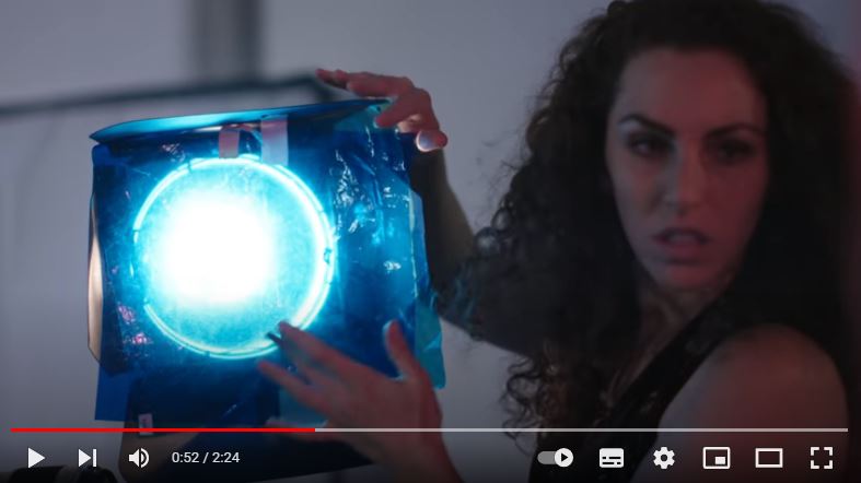
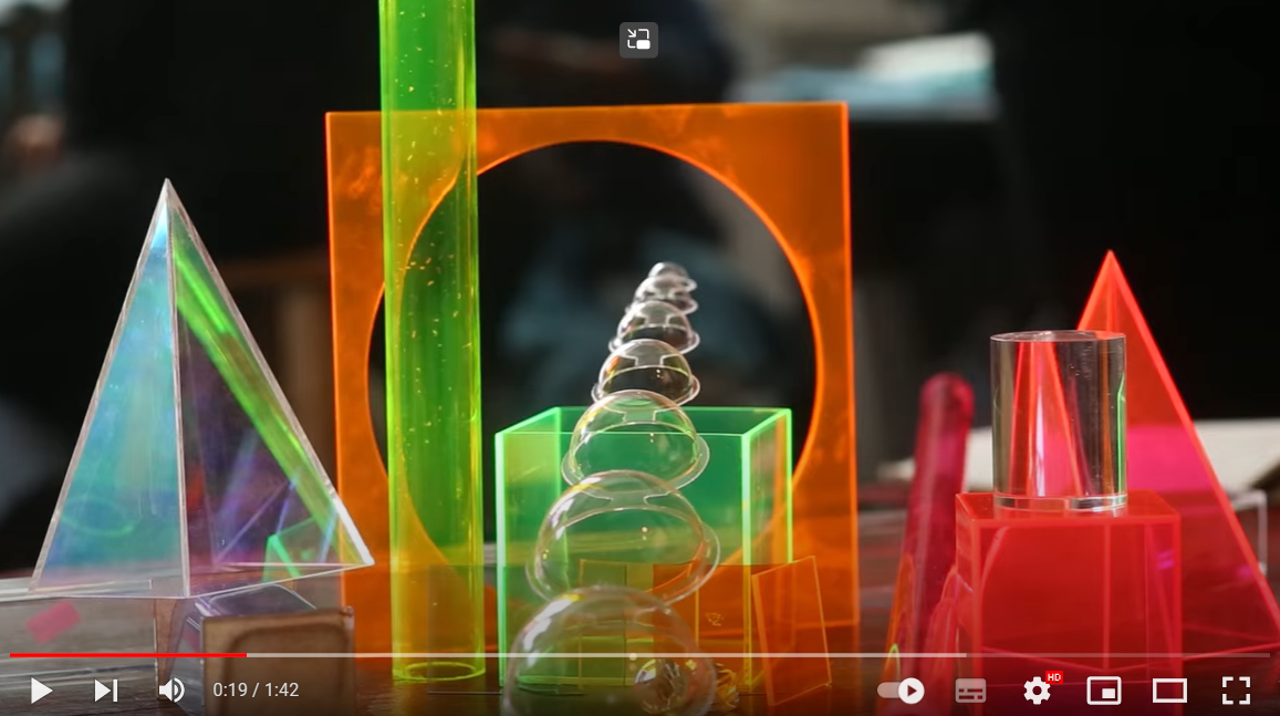
Adler uses colour gel filters over her lighting to have the various colours coming in from different angles. This technique helps her to be dynamic wit her colours because she can regularly change them rather than using a coloured light. This is an example of what a colour gel looks like and how Adler herself uses it herself.
|
Lindsay Adler / Colour Gels and Shadows

|
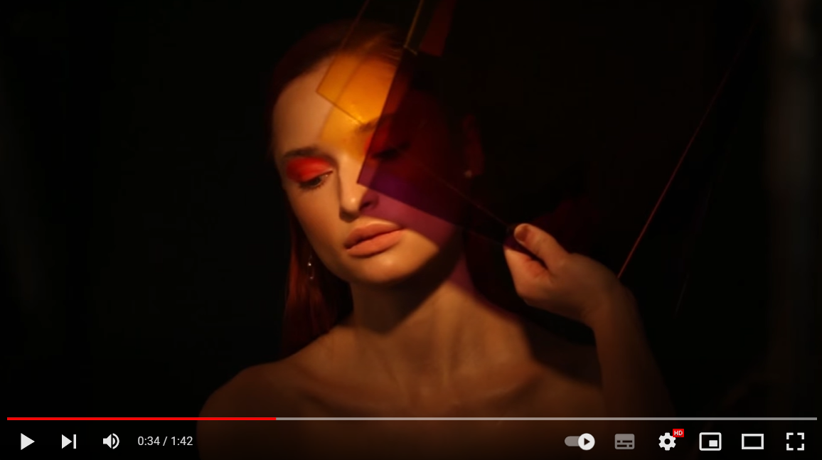
In this video, Lyndsay Adler uses colour gels and shadows to create a unique display of colours to present the sexuality and depth of women. In regards to actual props, Adler uses different shaped colour gels lit up with a bright lit in front of a black background to create elements of contrast, shape and colour. The black background helps to focus the eye on the colour displayed onto the subject. Adler uses colours overlayed onto each other mostly which contrast or complement each other while also creating lines on the models face with the colour gels and the light. She has a multitude of forms and shapes of colour gels so she can create a variety of shapes upon the model but
|
mostly uses the simple square shape creating harsh dark lines across the model. The way the models are presented can reflect the sexuality of women from simple the fact that they appear naked nut that is deferred from the colours surrounding them which suggests the actual depth of women behind simply their bodies. The opposing colours can reflect how women are capable of complex emotions despite what some of society may think. The poses can also make the women appear mysterious especially the right woman in the snippet. By covering most of her face in such a deep red she looks mysterious but also melancholy and elegant.
Adler also uses different shapes of colour gel with which the model can interact with the create unique poses, shapes and shadows. This also gives it an abstract effect increasing interest within the image beside just the colour. For her images, she makes the makeup, hair and nails of the model all correspond with the colour gel used weather to contrast or complement.
|
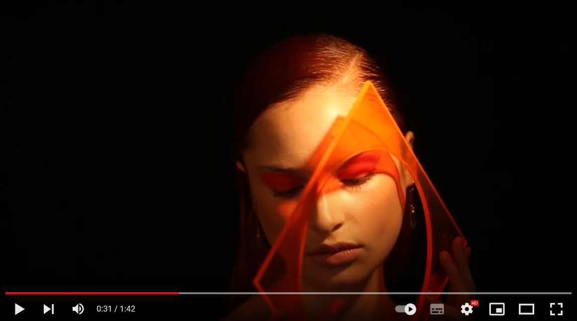
By using the colour gels of unique shapes she is able to create different shapes with the shadow while also involving the actual gel as a prop. A prop such as the one in this snippet can be used within the image in a variety of ways with the model as demonstrated in the video whereas props such as the triangle can be used also in a variety of ways when playing with light.
|
|
Adler layers the colour gels on top of each other with complementing or contrasting colours. This can make the image look brighter or darker depending on which colour she uses as the difference and can create an interest point where the rest of the colours in the image are relatively similar like in this snippet its yellow, then she uses the purple to stand out.
|
To make the colours pop more Adler uses a black background while also lighting up only the model to help create the shadows with the colour gels and the create contrast between the actual model and the black background. This is very evident in this snippet especially because there is a variety of colours throughout the image which help them jump out at you more.
|
Shoot Plan / Reflection Shoot Plan
|
I have drawn inspiration from Lindsay Adler because of her use of colour and contrast which creates the desired atmosphere for the shoot. She is inspirational throughout the shooting process to pick apart every detail to have the perfect shoot while she also thrives to convey the strong inspirational women she is which I find very empowering.
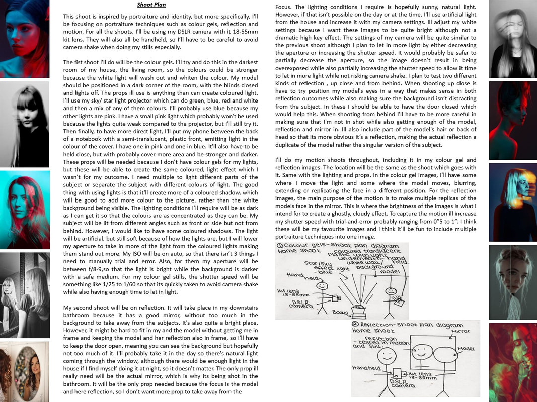
My shoot will take place in my classroom right before and going into lunch so because its midday there will be plenty of light coming in from the window but I wont be using it and will rather use artificial light so the location doesn't matter as much. The props I will use will be coloured lights that ill set to different colours, contrasting and complementing. Ill probably also use a white light to make a clear focus, but most of the images will be using coloured light. Ill also need a background, the one ill be using is a light black, navy colour with white dotted sections. I'll |
|
also need a model, who will be the people in my shoot group, and they'll have shiny makeup on to reflect the coloured light and cover the face better.
For my lighting, I'm trying to create a low light effect so the images will have a dark undertone, but then I'm using coloured lights t light my model from the side, beneath or on top even. The colours will be a variety but mostly bright colours such as blues and greens and I'll also have one white light if I want to contrast the colour or background. I'm also interested in using the plastic string fairy lights because it will add more interest into the subject and can better interact between the model and the lights.
The equipment ill be using will be my DSLR camera with its 18-55mm kit lens. It will most likely be handheld to get a more diverse selection of angles, with this I can also get closer to the model without a tripod being seen. For my camera setting, I'm not yet sure what the setting swill be but it'll need to be one hat lets in enough light that the colour is strong but not so slow of a shutter speed that theirs motion on the model.
After the shoot i will digitally edit my images of Pixlr E to enhance the colours and mood. I will then display my best images probably by picking 4 images and detailing pros, cons, the editing process and why its one of my favourites. Accompanying this I will explain the editing process. Either that or a simple grid of my favourite images.
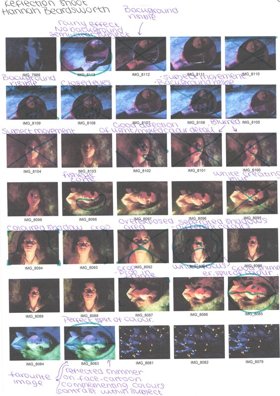
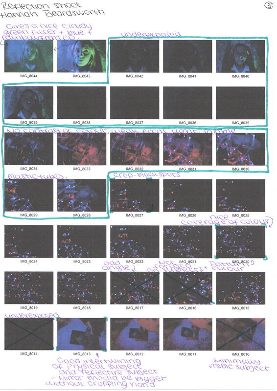
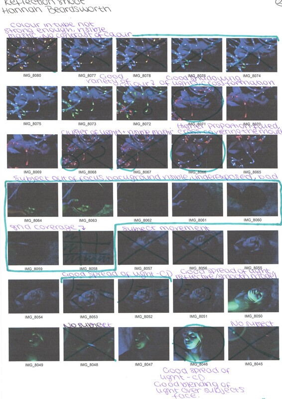
Contact Sheets / Reflection Shoot
|
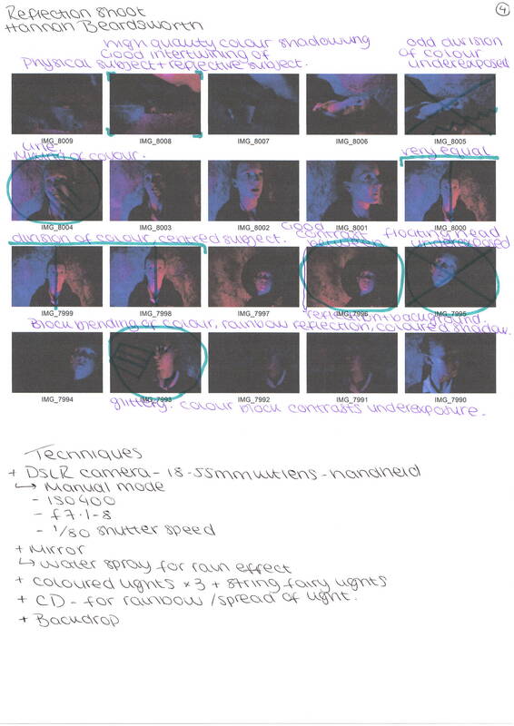
|
9 Best Images / Reflection shoot


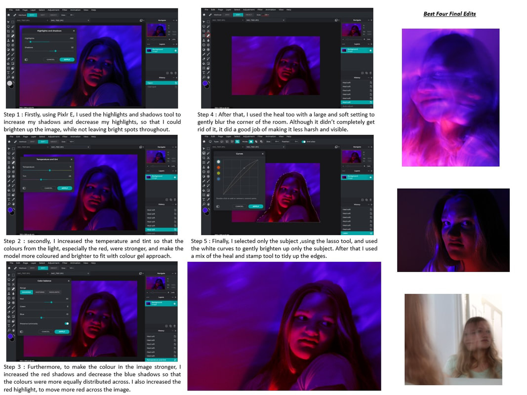
Editing process / Reflection Shoot

Step 1: Firstly, I selected subject then inverted selection to select only the background so that I could increase the shadows without lightening the subjects face since its alrighty quite bright and white which is the look I was going for so that the shadows could stand out more, so I didn't want to change the face light.

Step 3: After that, I went onto editing the subject by firstly selecting subject and then using the colour balance tool and changing the midtones and shadowing. This was so that she blended better into the background but I ended up only doing it mildly because I still wanted the white to stand out. For the same reason I didn't edit the colour balance of the highlights.
|
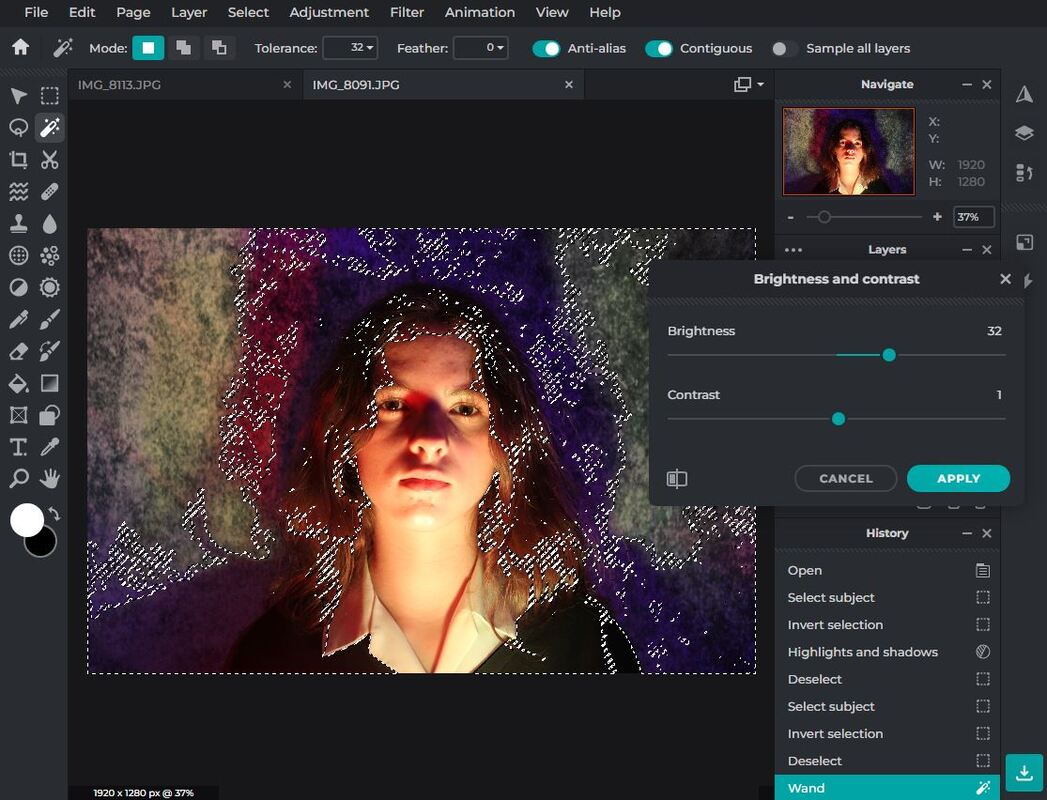
Step 2: Then, i used the magic wand tool to select all the coloured shadows and increased the brightness of them so that the colours popped a but more. I tried using the colour balance tool but it ended up warping the blending of colour so i used brightness and it worked much better.
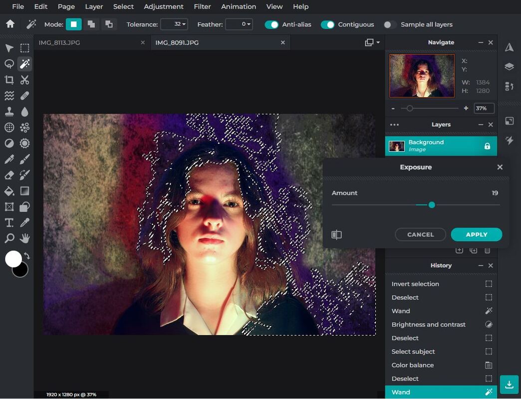
Step 4: Finally, I used the magic wand tool again to select the darker parts surrounding the subject, mainly the blues and the shadowing of her hair, and slightly increased the exposure. I didn't do much because I still wanted the dark shadowy effect but without turning her hair blue. I also wanted the only white to be from the actual subject so I kept the shadows quite dark.
|
Final Edit :
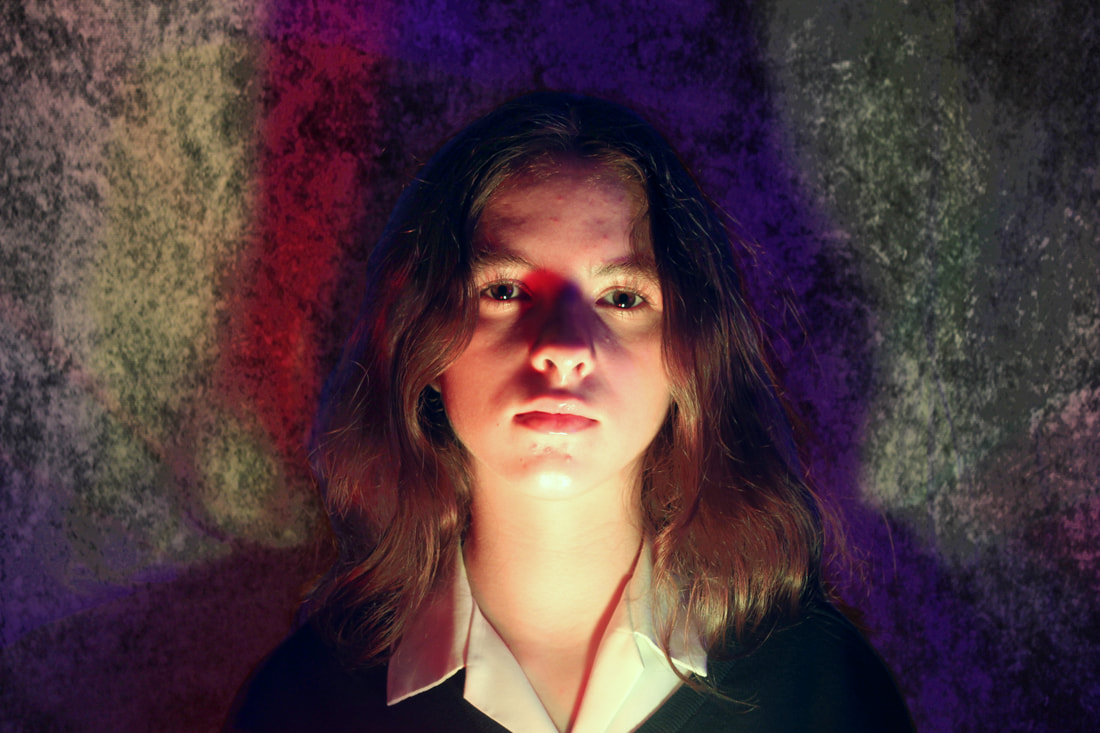
Best Image / Evaluation

|
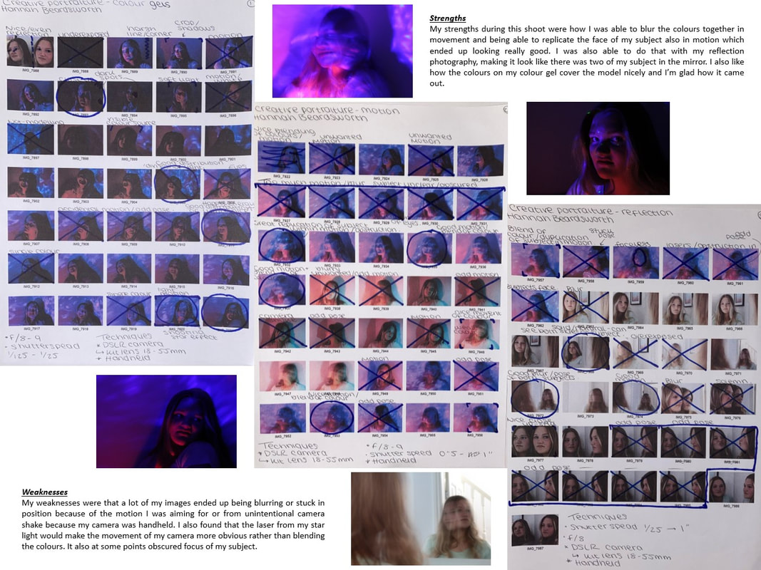
During this shoot I was able to explore portraiture and identity more deeply while using more complex professional props and just having more props to experiment with overall. In this shoot I tested with colour, shadow's, contrast, harmony and balance. The props that I used were coloured, bright lights, string coloured lights. a cd for reflection, mirrors and spray for reflection and mood setting, black and white spotted background and my DSLR camera.
Some of my strengths during this were shadows of colour which I love and was able to control throughout many different images displayed on the model or on the background. Overall I'm happy with my control of lighting and how I was able to split it especially in this image, I also like how the glittery purple highlighter really makes her face shine in the dark blue section and actually ended up adding another colour. In regards to reflection I likes how in some of the images I could display one colour on the background and another on the reflection with the model. I especially had fun playing with the cd but putting the inside clear circle around my lens which made light circles or dots in the corners of my picture which gave them kind of a magical effect. I also had some weaknesses in this shoot where I struggled for example when shooting the reflection I found it really difficult to fit in the reflection and the background while not showing anything beyond the background in the classroom though the ones I liked which had that I was able to edit out. I also had trouble with the string lights because they kept showing up as just plastic because they were breaking but I just timed my pictures for when they were working. |
Artist Research / Maurizio Anzeri
"I take inspiration from my own personal experience and observation of how, in other cultures, bodies themselves are treated as living graphic symbols." - Maurizio Anzeri

Why this video?I chose this video because it demonstrates a variety of Anzeri's work from simple to complex. It shows a creepy variety of their famous physical edits using coloured string. It demonstrates more humane working were the string is complying with the forms of the subject but also abstract characters on top of their subjects, creating characters and shapes.
|
Why this artist?Now I will look at the work of Maurizio Anzeri as the start of my study in physical editing in which and image is taken and printed then altered by using a different artistic form. Anzeri uses coloured sewing on top of their original black images to distort the faces of their subject with mind playing coloured shapes and patterns. They are a good entrance into physical editing photography because they intertwine two simple artforms together to make an abstract and unique piece of work. Though despite the simplicity of sewing and photography the intricate detail needed to create this reflects their dedication and talent.
Why this quoteI chose this quote because it very easily conveys the inspiration of the artists work so you can better understand the perspective of their art. It also shows the social symbol in which they are wanting to portray. It also helps to better understand the artist themselves because it is directly from them while also not telling the observer how to interpret their work which is useful in such abstract works as thus. We can also connect the contrasting styles of needlework and vintage portraiture.
|
Who is he?
Maurizio Anzeri is an Italian contemporary artist born in 1969 who is famous for his portraits which he makes by embroidering patterns on old vintage photographs which he is then able to obscure by creating new figures, costumes and shapes onto. He uses synthetic hair to give his work an ominous feeling. This technique can also covey a phycological aura, as if revealing the subjects inner thoughts and feelings. his is done through his colour scale and intricate twisting circles.
Below are 10 Maurizio Anzeri images of their physical editing embroidery which I find inspirational because not only can you truly see the talent and dedication of the artist with the wild patterns going throughout the pictures but you can also see the diversity of their art where some are simple line art portraying an expression over the models face whereas other are masking the model as if plagued by the actuality of their form. The varying colours act like layer of the human in the image which is able to reiterate the complexity of the human form as a whole while additionally containing the ambiguity of the interpretation of their work by holding many other complexity's within the work.


Artist research / Lisa Kokin
"I like money in its shredded state because it is stripped of value and power. No one values money in this impotent state. it no longer has the ability to poison relationships, threaten democracy, topple governments, create privilege and misery." - Lisa Kokin
Why this artist?Along with Anzeri, I'm studying the works of Lisa Kokin because she is a mixed media artist who also uses string within her artwork to physically edit it, but she is also different because she more creates an entanglement of images connecting to one another with one another to create a deeper meaning. They're usually separate figures and people which she connects because of a shared group feeling or memory. similarly the images that she uses are old fashioned portraits of unique people. She also specializes in threadwork without the photography which is comprised of thin lines of thread which appear randomly places on the canvas, or she creates symbol appearing shapes.
Who is she?Lisa kokin is a textile and mixed media artist born 1969 from California who specializes in threadwork as both a physical structure and on a canvas. She has been inspired since she was a young girl when she would play with her family's upholstery, which is reflected now in her work as she often times use scraps and remnants in the form of recycled and reclaimed materials to create delicate pieces of artwork which are also good for the planet. That is part of why she is inspirational as an artist because she is able to take into consideration the physical materials that she is using in order to do better for the world, which is starting to be seen more in the art world due to climate change action being taken.
|

Why this video?I chose this video because it shows an array of all of her kinds of work that being structural and canvas. It portrays a tiny bit of her creating her work and in addition its all voiced by Lisa Kokin herself explaining her different artworks as they are shows. Previous to this it also explains a bit about lisa and who she is which is good to help get better knowledge of her work. This personal input makes the video more reliable and understandable. It shows her diversity of artwork with and without the images were focusing on and she is able to explain the bigger pieces that she has worked on recently and in the past.
|
Why this quote?
i chose this quote because its an interesting take on economy and average lives in a capitalist world because though it is needed to survive it can also ruin wh8ich she highlights. This is also a universal topic that can be related to as many people have felt the tension when money is brought up or ruined relation ships with friends, family and partners due to money and the difference it can make on people depending on how much they depend on or have. By shredding money she is taking away its power which is inspirational because although many may say it means nothing to them, money controls peoples lives by allowing them different, unequal opportunities in life. It is the dictator of many lives and by shredding it she is making a mockery of those who depend on its value without understanding its poisonous abilities which controls people in a different situation to theirs lives.
Below are 10 images by Lisa Kokin which I find inspirational and will try to reference or remember in my shoot later on. I chose mainly images involving photographs of varying people which I would be able to emulate. I find these inspirational because they are able to incorporate the digital age and medium of photography in a structure, connected by her threading. By doing this she is able to portray messages of invisible strings between people, strangers or friends. Here you can better understand what is meant by structural medium and her canvas work. A unique work here is the one with the woman who is almost being revealed from the paper, and the stitch gives it realistic cracking and aging however my favourite is the circle of people connected by string and displayed on book paper because it gives an interesting portrayal of community in an environment;.


Artist Research / Magdalena Berny
"In photography,I avoid references to the modern world while I often try to embed them in a climate of fairy tales. The inspiration for me as a photographer is all that surrounds me." - Magdalena Berny
Why this quote?I chose this quote because it gives the audience a better understanding of her inspiration which is always useful to know especially before exploring an artist, but from this we can reflect our knowledge when we look at her work to better see her intent and the composition she did to portray her work in this way. For Magdalena Berny specifically, you can truly notice the fairy tale inspiration in her work enhancing her as an artist who works to perfection to portray her inspirations and I think she does this really well. Additionally yo can understand her reasoning for photography, she isn't doing this for society or to prove a political point, it seams to me more like she's adventuring with her own inner child.
|
Who is she?Magdalena Berny is a self taught polish photographer who specializes in child, family and portrait photography and has been able to create her own distinctive style over the years. She uses illustrations as guides for photographing children which help give it the wonderland style that appears in most of her images. Her images have appeared on many book covers also. She is inspired by the world around her which is represented in many of her images with children pictured in fields and on streets or with peculiar or abstractly mundane images which perfectly complement her dreamy style.
Why this video?I chose this video because it displays a wide array of her images allowing to demonstrate how she is able to carry an innocent and dream like trope throughout all of her images regardless of the setting or subject. It demonstrates how she can create both thoughtful, sharp images and picturesque, fantasy style images. The photoshoot arrays also show how she can tell unique story's in her images and photoshoots really emulating her inspiration of fairy tales. Furthermore, its quite a long video so you can see all of her images clearly to admire the composition and effort which she proves into her images. Even this image on the thumbnail i find admirable because it is sharp while also holding properties of a painting adding to its fairy tail state, I also admire how their is a black setting, but it seams as though the child is able to light up the entire image which is quite breathe taking.
|
Why this artist?
I chosen to study Magdalena Berny because i would love to explore and emulate her dreamy, fairy tale image style as I've mainly focused on darkening the subject in my earlier researches but she rather goes to a place of happiness and fantasy which I find inspirational. I also feel I could emulate her work which I am excited to try in the near future because it is her composition that is technical to create her style but the setting and subject can be easily emulated I just hope that the aura of her work is carried to mine. I will do this by using a sepia tone and I might use my papershoot camera to give it a blurry vintage effect. Berny is a good change of artists because she has more innocent intent rather than something socially or politically moving.
Below are 10 images I have found of Magdalena Berny's work which I personally find inspirational to my own work. This is because there is a nice simplicity in her images with the familiar setting and her subjects being any child. I also like how she makes the child fit the setting by dulling them or letting the glow and shine like the setting. I also love the intertwining of the environment to the modern era, it portrays how the world and the environment can never go out of style, and how it portrays the diversity of nature that it can be many contrasting feelings and settings which she captures in a variety.


Artist Research / Marc Lamey
In my opinion, the most important thing is creativity, having your own style and not copying. Be able to read the light however it is outside or in studio. Experiment a lot and know perfectly the technique which you are working. - Marc Lamey
Why this quote?I chose this quote because it reinforces his title as an original artist, which I could already see in hos work as I've never seen this style before with the intertwining of different things is it is evident that he does follow this advice. It also gives great advice that experimentation is the way to get the perfect images, not even professionals can get it right every time but they just experiment, trial and error until they get it perfect and come out with these amazing, creative images.
|
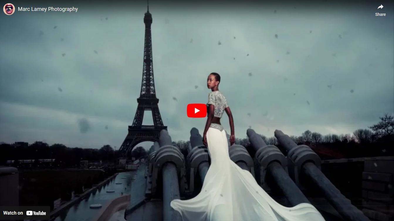
Who is he?Marc Lamey is a professional French photographer located in Paris who focuses on mainly portraiture photography working on fashion and implementing beauty into the cityscape. He is strongly inspired by music and uses his photography to impress and express but also to symbolize his interpretation of the portrait and beauty which he allows to be read on many levels by his beauty. He has been featured on many magazines in France and around the world as well as multiple galleries'.
Why this video?This video is great firstly because it adds motion to his images, which i think really empowers both his images and the women in them, making them appear fierce and strong. Furthermore, it displays an array of complementing images with the same mood, the bluey hue which I think really helps it to flow throughout. Furthermore, each image display has added seasonal interactions, such as leaf's for the autumnal ones, or snow in the winter ones. I also like how it displays how he includes famous landmarks in this array of images more specifically there is many of the Eiffel tower which I've never really seen before in my research. However, if you go onto his website you can truly see the diversity of his work.
|
Why this artist?
I have chosen to research this artist because of his very wide diversity of work which is amazing how he doesn't just have a singular style but can perfect an array of different and unique compositions. He also clearly must use editing after his images to get an intertwining of multiple clear and related shots and some of them are way too crazy to have been an actual image such as the one in the thumbnail where the lady is on a roof outside the Eiffel tower, or some of his when people have bugs in their mouths. Although I would be so impressed if they were actually not edited but with modern advancements these kind of shots aren't needed to be done it crazy circumstances. However, on its own his composition I find really impressive and inspiring and it is actually quite abstracts due to the pictured situations which strengthen the model and image.
Below are 10 images from Marc Lamey which I personally find inspirational because of the unique composition and unusual techniques used to create such work. I love how he create his own style and which I as a photographer aim to be able to develop and create. Furthermore, the clarity of his work despite having so much going on in one image then contrasting to other works of his which are so effortlessly simplistic while still keeping it abstract elements. He just shoots the unimaginable which I find inspiring that he can really push the boundaries of classical photography.


