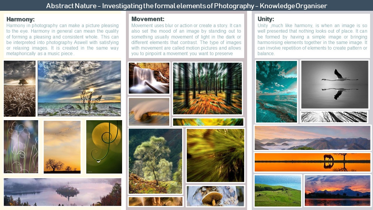
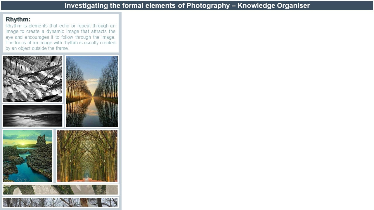
Abstract Nature: Personal Project 1

Abstract Nature: What is Abstraction?
abstract photography or non-objective photography is images of objects that are modified so they are unrecognisable as the real version of the object but of an edited version which has been made using special software, processes or materials therefore making something as seen of not of this world. it is a technique which is seen as outside the subject matter and by using different subject matter of ordinary things takes the photography outside their comfort zone. usually, abstract photography consists of vibrant use of colour, tone or other formal elements of photography and art to highlight specific, close-up sections of an object that aren't normally seen or put in this kind of light. below are some examples of abstract photography that inspire me, or I visually enjoy that helped with my initial delve into abstract photography and the formal elements of photography.


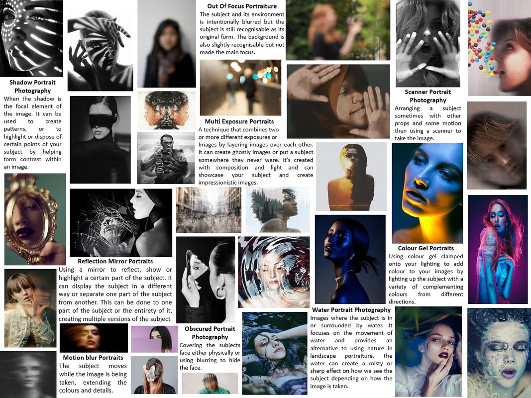
Abstract Nature: Investigation Of Abstract Photography Techniques
ICM
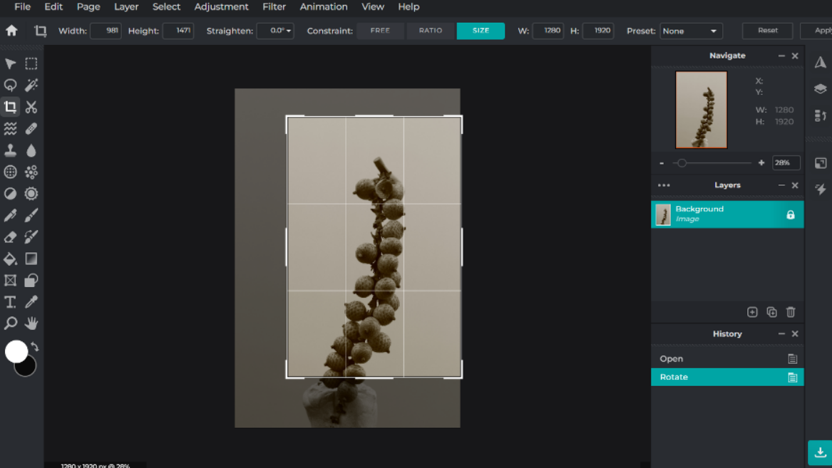
Contact Sheets - techniques and annotations

|

|


|
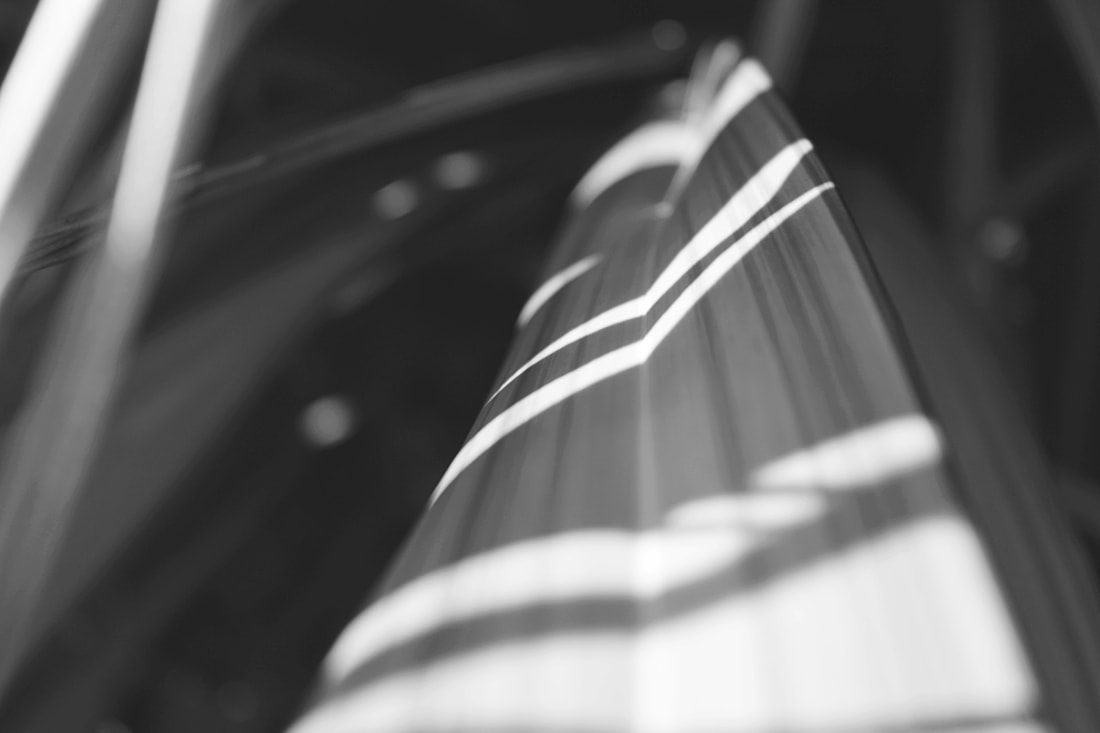
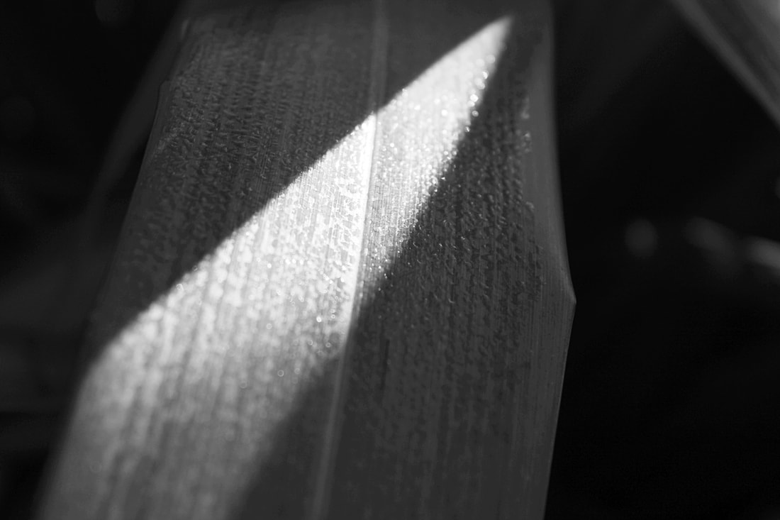
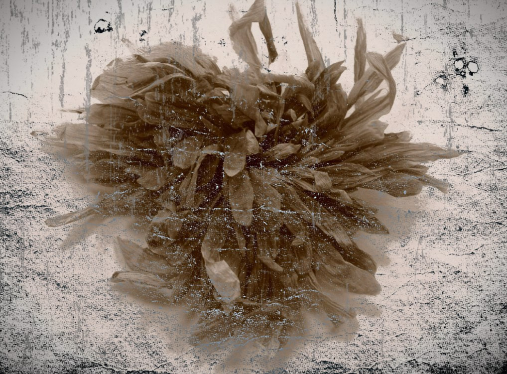
ICM is intentional camera movement. This can create a watery or blurred value to an image. it is created by movement of the camera in a single sharp movement in any direction up and down can elongate the look of the object and by moving it 90 degrees to create a spiral. The movement of the colour's forwards movement in the picture and although the subject is blurred it should still be identifiable to add to the effect of deteriorating an object to make it less like its natural form which means it's an abstract technique creating an abstraction in my photography. It can also create a painted effect to a picture because of the movement replicating that of a painting.
To make this shoot I used a plain white piece of paper for the background to contrast with the variety of pinks, greens and whites of the flowers and its leaves. I created the floral arrangement so there wasn't too much of the same colour blending together and I could still have a focus. It also helped me control what directions I was going with my DSLR camera on sp/s mode set to 1" or higher so I could blend and blur all the colours together and not just one of them. I didn't use I tripod I hovered over the flowers so that I could have more natural movement, but this made it tricky to get the whole subject in the image and not just a section. I used my camera and lens and the natural light in the classroom. My strengths in this shoot were creating different kinds of movement and blurring but not blending the colours together too much, I especially like the bottom row middle because it has a wavy effect but also looks a bit like crumpled up paper, I really like how its movement is so different to the results of the others. I also liked how in most pictures you can still see a main focus and not just a blurry spot. Some of the limitations of this shoot is that it was hard not to drift off from the subject when moving the camera so it's just in the corner and some were just completely white paper. The circling motion was the hardest to create because of the restriction of being able to move my hand quickly in a whirlpool rotation and the other restriction of wandering of from the subject which is why I preferred the outcome of my other motions. |


|
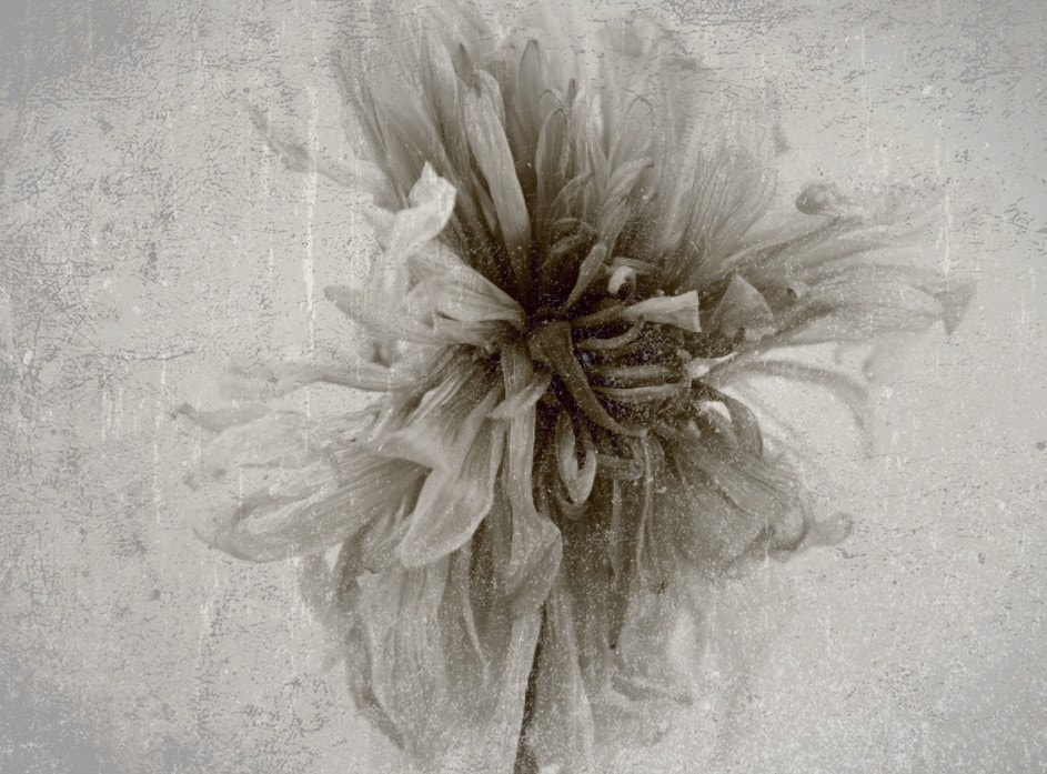
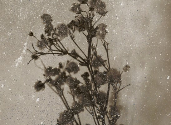
Monochromatic Photography
Contact Sheets - techniques and annotations


|
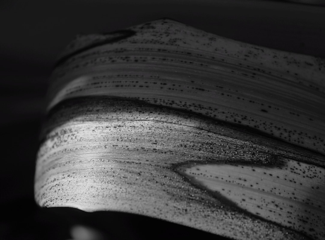
Monochromatic photography is tacking images in the black and white scale/ only one colour and its shades. It can draw attention to small details that in colour would have been ignored. To create this effect, I used my camera like normal but with the picture style set to monochromatic. The shade and amount of detail can be changed by the amount of light being let into the camera or being represented in the imagery like shadowing or light rays. This is an abstracts technique because the aspect of colour was modified so the subject is less recognisable, but this example of technique is not too far abstract because it is not completely steering of from its natural form.
To make this shoot I used my DSLR camera and zoomed into the plants or got really close to them at eye level and close up. I used plants and leaves in the bush of the school car park. The lighting is the natural lighting because this shoot was outside, and it was quite a bright day. I put my camera along the top of the longer leaves and followed it down with the angle of my camera to create a shallow depth of field and mainly focused on lines or dots of withering on the leaves to create a high contrast of dark and light. I also used shadowing to create section of light or shadow on the leaves. I could also use the sky and higher up plants to create this same contrast. I also focused on one part of the leaf as a main subject creating a blurred and busy effect on the background. My strengths during this shoot were finding details that I found visually pleasing and zooming in on smaller details of the section of plant that I chose and am very pleased with the outcome of my final 9. Some limitations of this shoot were that sometimes they were blurry because I had to take them through the screen, so it was harder to know if it was right. It also sometimes let in too much light or too little to make it over or underexposed. It was also harder to autofocus on the plants because I was so close and needed the light to highlight the focus and what I wanted to zoom in on and I had to be careful with my camera not to hit the lens with the leaves or sticks from the bush. |


|
Best edits:
|
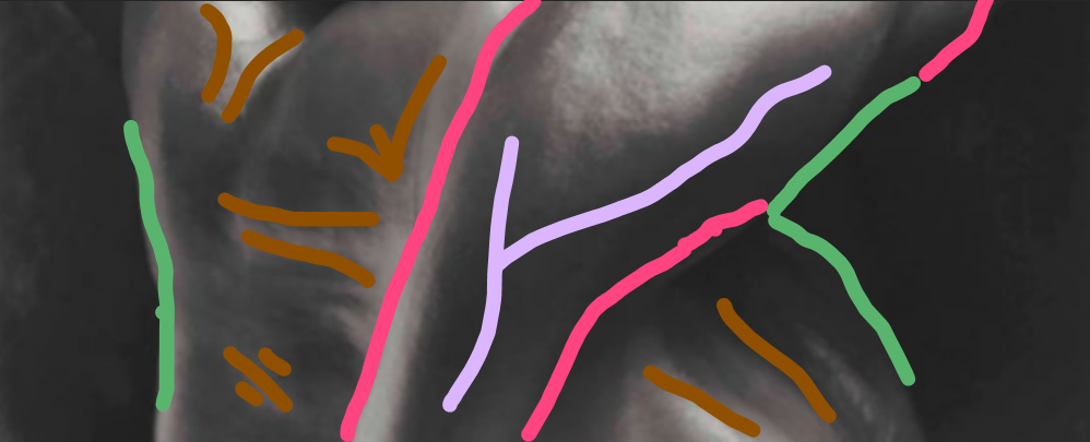
I have chosen this image because it shows lots of different elements and techniques. There is a good contrast between light and dark with the line of lighting and the darkness of the shadows in the background. there is also lining shown on the leaves directing the viewer and, in the lighting, creating arches of line spraying across the leaves. There is also shallow depth of field at the end of the leaf which is guiding the viewer but not into complete darkness, there is some specks of light reflecting on the things at the end, but it isn't comprehendible.
When editing this image using pixlr E, I increased the white levels to further highlight the light but then adjusted the highlighting/shadowing together so that the contrast is still there, but you can see further beyond the focus. I used auto pop to make the focus and the shadowing sharper. Finally, I cropped out some of the plants at the front of the left and right side and toward the back of the framing so that the subject was more central, and the image wasn't too busy and distracting. Some strengths of the technique shown in this is that it creates patterns within the subject that are more noticeable that it would have been with colour and allows there to be two different focuses, the lining of the plants and the highlighting of the lighting. This is shown in the pictures from editing underneath the main image. the first is the original image and what a cropped, the second is the direction if light (in yellow) and direction of the subject (in red). |


|
I have chosen this image because of its unique patterns and combination of different lines and shapes to create the pattern on a single section of natural form. I also like how the line of light is only on one section of the leaf which seems to spread along the lines and as its filtered out by the darker spots on the leaf it creates more of a glittery effect further down. The light also highlights the bend in the subject beyond what the camera can see.
To edit this image using pixlr E, I cropped the original to cut out extra darkness in the back that had no additional effect, it also helped focus more on the subject and be able to see more of the texture on it than if it was further away. I used auto pop to, again, make the texture clearer and it also made the light spread more along the lines. Finally, I increased the highlighting/shadowing ratio so that you could see more of the plant and its background that was before shadowed instead of only the part covered in light. The technique showed success in this image to create more patterns with the different shades of black and nicely distributed the light, highlighting it where you wouldn't normally notice it and further contrasting with the darkest spots of the leaf. This is shown in the pictures from editing underneath the main image. The first is the original image marked out with where I cropped, and the star is the overexposed section that I needed to lower through highlighting. The second uses a grid to show the distribution of pattern and lighting around the centred and focused section and how the increased size from the cropping helped enlarge the direct the viewer to the texture. |


|
I have chosen this image because of the amount of visible texture and the shape formed by the light and shadowing which contrasts the background. I also like the lining on the form itself that helps centre the focal point overall and divide with the rule of thirds although it's not completely evenly divided there is enough coming out from the middle to make it work with the rule of the division. The shape and direction of the lighting helps direct the eye to the main focus and towards the front of the subject.
To edit this image using pixlr E, I turned up the white levelling to brighten it up and create more emphasis on the texture and the lighting and to add light spots in the background to try and highlight and existing form to create a smaller busy environment behind the main focus. I also cropped the image so that the section of texture that wasn't blurred didn't take up too much of the photo to make sure that the actual texture wasn't ignored and because some of the bordering part of the plant was blurred. The technique showed success in this image by highlighting texture because of the faded black and white scale used in the colouring and exaggerating the contrast between light and dark. This is shown in the pictures from editing underneath the main image. The first shows the extreme contrast between the highlighting and shadowing that I needed to change through increasing the white levelling and decreasing the dark levelling, this also helped focus the texture. The second shows the lining created by the subject (in yellow) and the lighting (in red). |


|
I have chosen this image because although the contrast of dark and light aren't very strong, but it shows line and form in the subject which takes up most of the framing but there is still lots going on in the background giving the focus solemnity and further highlights them giving it shallow depth. I also like how it has natural highlighting and shadowing in the form rather than being created by lighting and the black helps exaggerate this range of colours even though it uses no colour at all.
To edit this image using pixlr E, I firstly cropped it so that the focus and more texture was mainly visible, and you can see clearly was larger and more central because some of it at the bottom was too blurred and taking away from what the focal point. Also, so that it wasn't too crowded with there already being two main, larger subjects rather than one. Then I increased the white levels and adjusted the highlight to shadow ratio because some sections of the back seemed overexposed, and I didn't want it to be distracting. It also helped lower the already small contrast between darks and lights on the subjects because I didn't want to focus on the light colours but the lining and dotting of the darkest sections. The technique showed success in this image by emphasising the shapes and lines created on the subjects which so highly contrast its neighbour, it also helped make patterns behind more visible in the form. This is shown in the pictures from editing underneath the main image. The first shows the original image followed by the cropping on the second. The third how the lining and pattern created by contrast of colour on the subject (in red) and the centred directing of the subject creating equality and harmony throughout patterns (in purple). |


Shallow depth of field
Contact Sheets- technique and annotations


|
Shallow depth of field is the visual distance between a subject and another. It can be created by focusing on one object and blurring out the rest to create a short distance between the viewer and the main focus and expand the distance between the main focus and its background. It can also be created by following a line to lead towards a focus or elongate it therefor widening the image as well and creating depth. It is created by increasing the aperture or lowering the f stop. This is a lesser example of an abstract technique because the environment is modified so the subject is less recognisable but because of my specific subject it is still very obvious of what the environment and focus is.
To create this image, I used my DLSR camera on aperture priority with an f stop of 5 and set the white balance to cloudy because I took them outside in my garden on a cloudy day. I zoomed into the subjects to make the background blurry creating the shallow depth of field and made sure most my pictures were taken surrounding other plants to create a greener background with more nature other than a fence. Near the end, even though it was raining, I threw water on some of the plants to add to the detail. I tried to get different angles and follow any lines on the plant to create more depth. I got to eye level for close ups and ariel to create a subject in the middle. Some strengths of this shoot were that it was quite an easy technique to use overall, I just had to find a subject and get as close as I could to blur the background and, in the end, I found enough subjects to have a variety. There were also some limitations of this shoot such as the weather. as I said, whenever I went out it started raining and when it wasn't it was still cloudy, but I just went out after it started raining and used my cameras abilities to change the lens to adapt to the little amount of light there was because of the clouds. Additionally, because this shoot was taken at the end of October most colourful plants or any plants were dead but I did find one bit of colour but there is a large number of greens which doesn't matter because it's still nature and I did end up finding different shapes and sizes of plant so it's not all doubles. |


|
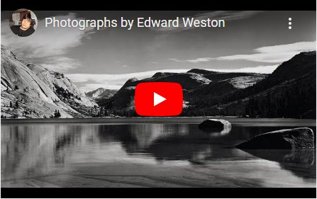
Artist Investigation / Edward Weston
"My own eyes are no more than scouts on a preliminary search, for the camera's eye may entirely change my idea." - Edward Weston
Why this quote?
I chose this quote because i think it really goes with the header of abstract nature because he was able to create art out of what most people just see as plain background items. It also highlights how it is abstract photography, with cameras being a fairly recent thing overall and his ability to teach himself how to work it and use it in a way that he liked with an appreciation for his work. It typifies Weston's work because it glorifies the power of the camera and how it can capture something you might notice and like on passing but the camera can take that and let you see what you could have once missed. |
Why this artist?
To begin my Abstract Nature artist investigations, I will initially study the work of Edward Weston because he used the abstract technique of his time, black and white, and every image of his is precisely and carefully made and thought about before taking it and afterwards when creating the physical copy. Who is he? Edward Weston was born in 1886 in Illinois and is known for his unique subjects showing texture and tones of everyday foods or plants alongside his landscapes and natural forms that people of his time had rarely seen before. His most famous pictures are his still-lives of peppers formed by a faze of shadowing and highlighting. Why this video? This video was inspirational to me because although the focus is abstract nature it showed the other forms that Weston captures furthering his ability of what he can create as beautiful. It highlights his flexibility as an artist and once again how it sets his apart from photographers at the time who were constantly searching for something worthy to capture while missing out on the things that Weston noticed and portrayed in his photography. This can be shown within his abstract vegetables but also within his simple landscapes which this video also presents rather than just the vegetables in which I'm studying. |
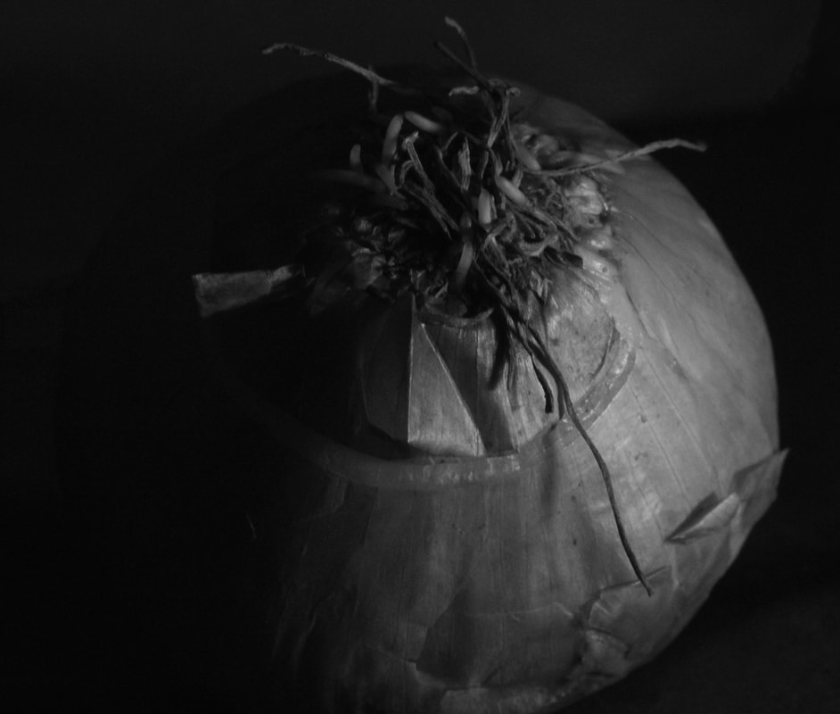
Below are 10 Edward Weston images of natural forms that are inspirational to me because although the work is limited with the black and white the subjects are clearly distinguishable and even feel bigger than they would if it was physically in front of you because he zooms-in on small textures and use highlighting to direct the viewer to what he wants you to see. Throughout the images, you are able to see how he experiments with the subject and its framing or cutting it open like he has done with the lettuce and onion to get a pattern that would not be seen from the outside. He also experiments with angles and lighting to increase the amount of texture that is actually visible and make it stick out more in the image.


SEMI Analysis / Edward Weston

|
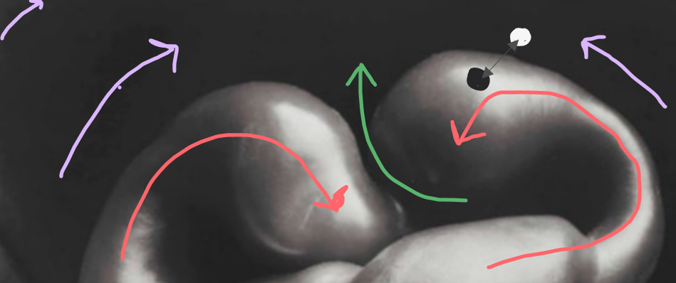
SubjectThe photographer of this image is called Edward Weston. The title of this photography is pepper No.30 and was created back in 1930 and is one of his most famous pieces of work. It displays a green pepper but is taken in a rich colour scale of black to white to present highlighting, shadowing and point out its curves and shape. The genre of this photograph is still life because the subject is solitary and there is no movement within the focus or in its environment. This simple type of photography was not seen at the time which sets him apart from the other photographers of his generations and why we still study him today. It is also abstract, using the abstract technique of black and white and is taken in portrait to extend and enlarge the subject. The props I can see in the image is a single lone pepper that we are told is green, but it is not presented as it in the image so that other elements are shown of the pepper which would not normally be seen.
ElementThe composition of the photo shows the pepper taking up the whole foreground with a small about of darkness and highlighting in the background to point out the physicality of the subject and to give it form. The rule of thirds shows the large
|
distribution of the focus because in every square and at every Intersection, part of the pepper is visible increasing the visual size of the pepper distorting it from its natural form. The viewers eye leads around the photo because of the composition and perspective Edward Weston has used that lead the viewer to the curves and natural distortions of the pepper through contrast of highlighting and shadowing that he created manually at the time. The perspective that Weston has taken the photo from is eye level, looking straight ahead of the subject, this is effective because you can see the entire focus and none of it is blurred as a result of a shallow depth of
|
field. It also helps eliminate any extra background that is unnecessary and distracting which is also a reason it is taken in portrait. The photographer employs a wide range of visual elements in his work that all combine together to support and emphasise each other, the most striking elements are form, colour and tone, texture and space. The form in this image is shown through the actual physicality of the subject in which the photographer emphasises through shadowing and highlighting in the subject and its environment. This reflects back on his reason for the shoot by taking mundane objects and simply putting them under a light, the form helps to remind the viewer of this. Another element prominent in this image is the colour or lack thereof. instead, this image uses tones and shades of black to white which is shown in the colour pallet. The use of the monochromatic technique is well portrayed because although originally a green pepper, the use of black and white helps to focus the texture and shaping of the subject instead of things such a colour that are normally highlighted in such photography rather than the form that he is able to create with lighting. It also helps signify the colour contrast within the image of the subject and its environment which is also what supports the form of this image and isolates the elements rather than the blinding, unignorable colour of the pepper. Additionally, a mix of black to grey colours are used underneath the subject, on the bottom of the image, to add detail to the outcome and give it a dusty, drawing
|
colour pallet
|


like effect. Texture is also an important element but is less prominent because it has the same effects as form but helps to actually prove the physically of the subject more and add detail to it which is a speciality of Weston's work and its abstract nature theme, the texture is needed in his work so that there are distortions to highlight and add an interest to the subject that rather than illustrating something that actually is plain, unused and mundane. Finally, the space in this image helps amplify the subject and really force the viewer to look into it rather than its environment and also make the texture easier to see and much more detailed. However, some space is necessary to have a bases contrast to compare the form with, in this case, the darkness behind the pepper and the highlighting on the curves of the subject. This image fits perfectly into the rule of thirds with each square having a faire distribution of the subject and further focus on shadowing or highlighting.
Media
This photo has been taken from a short distance as to fit the entire subject into the frame and zoom in on the details or warps of the object being the point and theme of most of Weston's work, this is done so that the pepper is the focal point. The pepper has been

|
placed in the foreground, by doing this the viewers eyes are led directly to the pepper and because it takes up most of the frame, there isn't anything in the background to distract from the focus. The foreground it used to create form on the subject with shadowing and highlighting. It creates lining, directing the viewers eyes to the pepper so there is no other focal point. This is also created by the short distance of the photo being taken and the eyes view angle because there is no blurring on the actual pepper to draw away from the entire object. This photo had been taken in a studio using artificial light and light subjection in a dark room using selected exposure by dodging and burning to create the images light and dark spots. The light source is placed on the top and from the bottom left, so as to get light on all of the curves but they must be weak lights because there is still a darkness in the middle. On the other hand, that could be created by a natural deepening of shade on the pepper. This is highlighting the curves and creating shadows, but the natural form of the pepper helps as well to darken sections that are further in or out and create a line distinguishing the end of the pepper and the start of the background. This creates an atmosphere because the light is what reveals to the viewer the hidden beauties of the subject and lightens the whole image whilst also darkening sections that are
|
|
unwanted by the photographer or are there to assist the highlighting. It also creates the grey tones that creates the colour pallet, which is extensive because of how the editing process works to create a natural , slow change of colour in which creates the shades and tones despite my much smaller scale, or else the image would just be an extremely underexposed blob of darkness like any image without light but because there is not coloured to bring light it depends on the actual light to portray the blacks and whites and a sense of serenity in the harmony between the shades and tones. It also creates clarity for the viewer on what they are supposed to be looking or searching for but still leaves an aspect and ambiguity with the variety of sections of the pepper and its background that can be looked further into. To emulate this photograph myself, I would use multiple light sources to have all aspects highlighted and would definitely take it portrait as to have a faire distribution of the pepper going out from the centre but also other focuses of the pepper in squares other than the centre at the top and the bottom and you can see in the edit of the image on the rule of thirds on the right. Additionally, I would also need to reasearch how Weston personally set up his
|

|
own lighten whilst taking the picture and not just throughout the editing process because he is able to create such a high contrast of the light and the darkness unless he created it during his editing in which I would, more easily than his, be able to emulate that exact effect with as much power as him.
|
IntentI feel this image coveys a message of beauty in the simplicity of life that goes unignored in everyday life and by isolating the pepper, a vegetable seen and consumed all over the world, by people alike and reflect a message on how life goes by, but we don't stop to appreciate the small things and most people are inclined to keep waiting for something big and mind blowing to
|
|
come along when the whole time it was right under your nose and you.ve already missed it but if you fix on it, it can be portrayed as a vastly different object, or abstract object as Weston was able to do greatly and much ahead of his time. He does this with his use of the monochromatic effect as a metaphor to life. It proved that he wanted to focus on the shape and form of the subject rather than its colour which would usually be highlighted therefor distracting from the other
|
|
elements that are usually ignored by the naked eye really proving the purpose of photography for Weston and for many other photographers. The use of distorted subjects also suggests that even though they don't look like the average pepper, fir them to go to waste is a missed opportunity that Weston takes the chance of what he knows society will do and disregard the odd-looking food that he is able to them take and take advantage of to portray it as something different. It also creates an initial perspective for the viewer to lead on from and it is
|
made clear by the use of little space surrounding the subject that it was the main interpretation he had in mind, but the mystery and peculiarity of the image overall makes it open to opposing or additional interpretations. This is relevant to the subject of abstract nature because he took natural forms such as vegetables and used the abstract technique of monochromatic photography. Furthermore, the uniqueness of the composition of the image add interest and draws a viewer in but the clarity of what the focus is helps it be clear from afar even without interest, of what it is meant to portray. Additionally, the image gives a sense of picturesque muteness and conveys feelings of calmness because of the lack of environment and isolation of the pepper and the simplicity of the colour scheme, highlighting and shadowing.
Technical Processes / Low Key
|
Low key photography is dark coloured scenes that use eliminating and highlighting to present a main contrasting form with no environment. It is mostly created with editing to darken areas that are not wanted to be visible and to lighten the subject, bringing it forward and giving the image form. They are also often taken in black and white to further deepen the contrast of the environment and the focus to point out its texture or patterns. It is a very difficult technique in photography because it can be difficult to separate and isolate the light and the shadowing. It is created with a low f/number and a high shutter speed to let in as much light while also being able to capture only the subject, so having so little light in the background that it isn't visible for distraction, but that part is mostly used during editing whether that's by hand as they would have originally or on software because it is so difficult to do both things at the same time.
|

|
Shoot Plan / Edward Weston
|
The inspiration for this shoot is Edward Weston because he took pictures of objects that had become mundane and every day and capture their textures and dimension while others felt the need to find something show stopping but missed what Weston had the eye to find and contort so it was mostly unseen at the time. I think that he despite his time is a modern artist because he could create picturesque images of background objects such as distorted fruit.
This shoot will be taken in the classroom in the morning with a mixture of ambient and natural lighting from the windows. I will need to take into consideration how bright it might actually be in the morning because its winter and I would like to create deep shadowing among my subject so ill have to not allow to much light to be reflected onto it but also highlighting the focuses curves or malformations. The props I will use in this shoot are a plant pot and a variety of texture fruit and vegetables to emulate the product of Edward Weston as the centre of this investigation and add detail in my product . The plant pot will create shadowing along the frame of the image and darken its environment by having no subject further away to focus on or distract from the larger subject to isolate it and help zoom in on its texture and patterns. This will also be helped by the plant pot because it will centre and direct the light onto the subject rather than its environment. You can also create further texture within the image by scratching the bottom of the plant pot giving the subject form and lining whilst also giving it a |
|
dusty, drawing-like effect such as in Weston's work underneath his focuses which is displayed in his famous pepper.
I require the lighting conditions to be fairly bright even though it is low key photography so that I can have a natural and highly concentrated direction of light to create highlighting on the subject but because its winter I will probably have to use artificial light so that its stronger to create a deeper contrast between the focus and its shaping to its environment to really emulate Weston's work. However, this will be made easier by the plant pot because I can change the white balance on my image to brighten the picture without brightening the environment because none of it is being directed anywhere in the plant pot that would be in frame. The lighting and final editing will help me experiment with low key easily so I can further understand the technique.
I will create this shoot using my DSLR camera in monochrome to create the black white contrast that Weston portrays with a small f/number to let in lots of light, which will very much be needed in the middle of winter and what I'm sure will be a sparse supply of natural light, but if I want a large depth of field I will use a small f/number. I will also set my camera to a fast shutter speed to capture the light in still life and sharpen the product without any blurred movement in the highlighting or shadowing.
Contact Sheet / Edward Weston

Editing Process Low Key Photography / Edward Weston
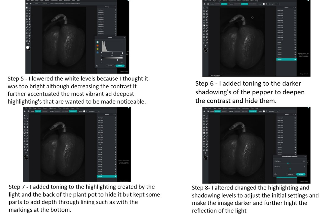
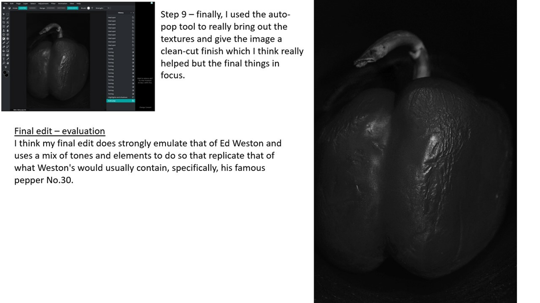
Best Edits / Edward Weston
|
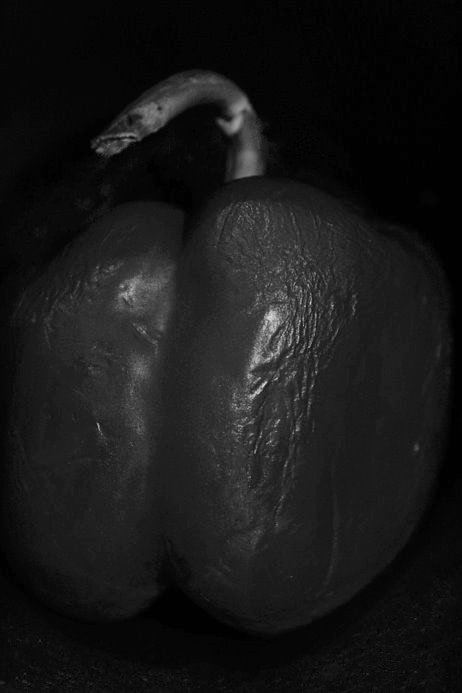
I chose this image because of its sharp resemblance in subject to Ed Weston's pepper no. 30. This was intended as an emulation of his most famous work and I think it was executed the best to my ability's. The strengths in this image are the distribution of high resolution texture with there being more on the pepper and where the light is directed so that the focus can be brought to the warping of the pepper (also picked out specifically to mirror Weston's taste) and creating a fisheye effect because it bring the centre closer and the edges seem further away. This also blurs the environment and background of the pepper as not to distract from the pepper and create a contrast of interest throughout the image. But I have also, however, used the background to create dimension and that dust like, picturesque detail that Weston's also contained. It also helps faintly distribute light to make the contrast smoother and less hard or rough. Additionally, it pulls the viewer from the abstraction of the picture, reminding them of its physical form and sense that is meant to an opposition to the overall image.
The editing process of this image is detailed above, I used a variety of editing techniques on Pixlr E to change the contrast and brightness of the image that allowed it the have less noise. I also auto popped to make it appear clearer and sharped some of the small details. The hardest part of the editing process was getting rid of large light spots created by the props I needed for this shoot. Because of the contrast with the darkness contained in the image and fading of colours that surround the subject going outward, it was a struggle to blend it or decrease its darkness without making it look artificial or unnatural so I did |
darkness without making it look artificial or unnatural so I did it the most that I could without it looking wrong at full brightness on my screen.
This image was taken with a mixture of ambient light and natural light, this helped to have initial lighting always there and direct strong lighting where I want it and where it had the most effective and powerful lighting on specific curves and textures. The use of Low key photography helps deepen the resemblance of Weston's work by completely highlighting the abstract. mundanity of the subject .
This image was taken with a mixture of ambient light and natural light, this helped to have initial lighting always there and direct strong lighting where I want it and where it had the most effective and powerful lighting on specific curves and textures. The use of Low key photography helps deepen the resemblance of Weston's work by completely highlighting the abstract. mundanity of the subject .
|
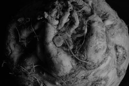
I chose this image because there is a very clear fade between light and dark that is visible by being portrayed on the actual subject entirely without needed the use of a background. I also love the subject entirely because it is still a vegetable but I've never seen one before and still don't know what it actually is. It also has an amazing amount of irregular detail making it look messy but the lighting gives it form which separates the messy sections to make them clearer. Additionally, the amount of texture automatically intrigues the viewer in the form of lining, patterns and shapes upon the texture. There is also a clear central of the image that creates a spiralled detail, subject and light throughout.
|
To edit this image on Pixlr E, I cropped out the background, which wasn't very much, because I knew I wanted it to be full frame image to really add a focus into the textures and details of the abstract, natural form. I also moved the white curve of the light so that there was movement in the direction of light but there is still and equal distribution of the subject in a gridding of threes but also a direct centre. I lowered the brightness so that the brightest and darkest points merged together more and so there wasn't a massive contrast that is just over and under exposed but more subtle, as this image is overall. I also used the lasso tool to expose or under expose certain parts that i wanted to be the bases for the contrast or to more fit by the lines of so it comes together to make a clear and quite final image.
The use of a strong artificial light helped direct the lighting across the subject in the direction that a choose and put light into every part that might be deeper and unseen by a weaker light in the texture. It also created a shadow that follows the directions of the lighting. The use of low key photography really helps to focus the viewer on the subject entirely and easier understand what the photographer, or what I , want them to see but still allowing it to be optional and open for interpretation to the viewer.
The use of a strong artificial light helped direct the lighting across the subject in the direction that a choose and put light into every part that might be deeper and unseen by a weaker light in the texture. It also created a shadow that follows the directions of the lighting. The use of low key photography really helps to focus the viewer on the subject entirely and easier understand what the photographer, or what I , want them to see but still allowing it to be optional and open for interpretation to the viewer.

|
I chose this image because of the softness of the texture that makes the image look clearer and cleaner. It also mainly uses lining as a pattern which can be followed throughout assisted by the light. There is also an of centre focus, being the biggest line of the lettuce that goes along the right side annunciating the 3 dimensional reminder of the form. And finally, the lighting direction follows the focus but is illustrated in the entire image as it is quite bright overall. These all join together to create harmony and large contrast in the image like a portrait on someone good side. There is also an attempt to add detail in the water that can be seen in some of the pits created by the walls of the lettuce but although it wasn't what I initially intended, it creates a glossy effect of certain parts , mainly the light centres, of the subject that is a textual contrast from the matte, sombre effect on the shadowing or darkest sections.
To edit this image on Pixlr E, I firstly cropped out the pot and window that was in the frame so that it could solely focus on the subject at hand rather than its environment, it also made details of the background that were in the crop, which I then |
underexposed with the lasso tool, less noticeable because the setting of the picture is unknown to the viewer. I also heightened the highlighting to make the weak natural light stronger and so that there was some white that i could move. I moved it with the curve tool to the right edge of the lettuce and moves along, fading away, down to the left. I also increased the dark level so that in the darkest sections, the subject was still visible but also gave it a greyer look that would contribute to the pitch black contrast of the background that surrounds.
The use of natural light helped to display the lighting only one the sections that could face the exterior and light but also block sections further in and away from the light, automatically sectioning a brighter darker contrast. The use of Low key photography specifically helped because of the brightness of the original form that wasn't created through the black and white spectrum so that the focus is really emphasised toward the lining, lighting and texture of the subject.
The use of natural light helped to display the lighting only one the sections that could face the exterior and light but also block sections further in and away from the light, automatically sectioning a brighter darker contrast. The use of Low key photography specifically helped because of the brightness of the original form that wasn't created through the black and white spectrum so that the focus is really emphasised toward the lining, lighting and texture of the subject.
|
I chose this image because there is a clear angle of how the image was taken and the way the subject was positioned that fits in different sections of the onion. I also like the obviously brighter-darker split through the centre of the image and the biggest contrast between not the subject and its background but the subject entirely. There are also very small sections of the subject that make it delicately broken up and imperfect and there is again an off centred focus upon the subject that creates a spiralling, this time being just above where the central square would be. Additionally, the different points created by the textures add to the elements and creates of variety of points in lining, and shape that directs to another section which is what forms it harmony and pulls it together. Furthermore, its adds abstraction to the subject which is a main element that was intended for this shoot entirely.
To edit this image using Pixlr E, I cropped out a lot of the background which was needed because it was taken from quite |
far away unlike the previous of my pictures. During editing this image had the most issues because the strength of the light mixed with angle meant that parts of the background in which split the lighting were very very visible and to deterrer from this, I made the lining less straight so that it would look unnatural and just like shadowing being created by the subject rather than its background. Additionally, because of the angle of the light opposed the the brightness of the prob used as the background, the back of the subject is much darker than the background but its also what helps hold the contrast wholly within the form.
The use of strong ambient light in this helps increase the white level of the of the picture that did not need to be adjusted like the natural light needed. Because of its distance from the light, the brightness quickly weakens into darkness instead of fading which is a unique factor that is very noticeable and an added characteristic to the image. The use of low key photography improved this image because it is what added abstraction to the form which was needed because of the solid normality of the subject also enforced by the angle however it also pointed out sections of the background I didn't want visible but that more easily adjustable through editing because of its use of the low key technique.
The use of strong ambient light in this helps increase the white level of the of the picture that did not need to be adjusted like the natural light needed. Because of its distance from the light, the brightness quickly weakens into darkness instead of fading which is a unique factor that is very noticeable and an added characteristic to the image. The use of low key photography improved this image because it is what added abstraction to the form which was needed because of the solid normality of the subject also enforced by the angle however it also pointed out sections of the background I didn't want visible but that more easily adjustable through editing because of its use of the low key technique.
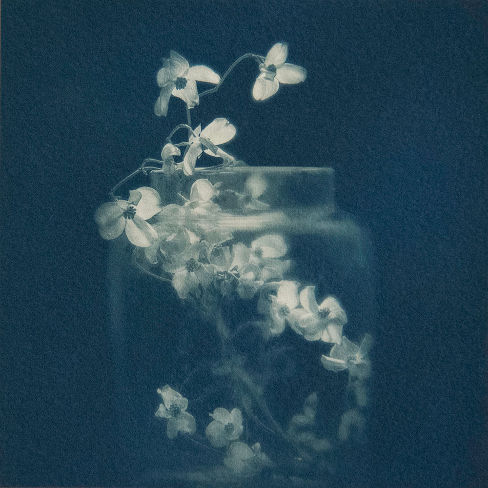
Abstraction through cyanotypes / Anna Atkins
|
Who was Anna Atkins?Anna Atkins was a 19th century photographer and botanist and creates cyanotypes of natural forms to create an image and was also known for being the first person to published an illustrated book with photographic images and one of the first female photographers to exist but for many years her cyanotype prints were not credited to her.
What is a Cyanotype?Cyanotypes were one of the first printing technique in photography being 170 years old and is created by using light sensitive chemicals and sun or UV light to print a greenish blue copy of whatever is blocking the light in Atkins case it was her plants they reverse light and dark to create an opposing contrast. It is a unique technique that switches the positive and a negative, creating and abstract outcome.
|


Advantages and Disadvantages of Cyanotypes.
Advantages of cyanotypes are that they are cheap and easy to make especially in places with a naturally high UV so can be exposed and created without any special equipment but they will expose under artificial light. A dark room is also not needed and can be contained in a normal room with the lights off. However there are some disadvantages such as it can come it pale if the lighting is blocked or not enough like is given. Also if your subject isn't partially transparent it will just create a blocky figure because the light wont transfer the textures and patterns from the leaf created by the thicker lining and the negative of the focus will control the outcome of the image which isn't what you want. Additionally, the colour block of negative in the background can vary in colour throughout the final product decreasing the amount of solid contrast and distracting from the main focus.
Modern Cyanotypes
There are still modern cyanotype artists using this method today printing on different objects beside paper such as wood or cloth, or using singular 3 dimensional cyanotypes together to create a collection. Although, it is an outdated process, it i still used because it now leans more toward being an abstract technique so is more rare and stands out among modern photographs and and can be used in combination with modern technology or resources to put an improvement of those in the past and create something unseen using wildly popular things but from different times like using the modern flexibility of art to create a 3D form. I also thing it compare to he use of black and white nowadays in that it uses the same technique but they come out in different colours so the blue of the cyanotype to a modern photographer also helps provide variety among other photographers but also having a colour and making abstract and lively.
|
I have chosen this image because i like its comparison to the original work of Anna Atkins proving how her work was influential but is also carried out under new artists and techniques so can help us view the changes of technology over the years from then to now whilst using the same medium. I also think that overall it is composed beautifully because of the modernisation of it. For example, the physicality of the subject is visible through this image which wasn't clear in Atkins as the product was 2D.
|
I have chosen this image because the use of cyanotypes is intertwined to create a display of 3D physicality from paper or photography. I like how it recreates something beautiful in real life and directly copies that, but also the use of the blue helps to give it colour and really show the lines and patterns, and to make it brighter overall in comparison to what it would have looked like using the modern technique of grey which would have make it bleak and add more negative intent and emotion.
|
I have chosen this image because its use of different colours beside the original navy's and blue also helps prove the advancement of cyanotypes since the start but because it still contains the original colours that are the only pallet of the other examples, shows how the cyanotypes of the past are still not fully changeable and even with the possibility, by completely changing colour the original form and technique of cyanotypes would be lost as modernity pushes through discarding the past.
|
My Cyanotypes |

|

|

In lesson, to make my cyanotypes, I used a range of different materials to print the outline and details of natural forms especially leaves and flowers to create unique shapes and patterns on a different form than I would typically use in modern day. I used subjects that I thought would provide the pattern and texture I wanted like the fern. I then exposed them to emulate the detailing of the form onto my cyanotype. I have printed on fabric, paper and have done a negative of my Edward Weston work which I printed onto acetate and then put onto paper and exposed into a cyanotype. I think my negative was the most successful because you are able to really see the form of the lettuce and the textures are clear while using a variety of colours to deepen or lighten an area just like a normal image. Additionally, its my favourite because my paper cyanotypes got blurred while being exposed which was really frustrating because their initial forming had good potential. I'm also not the biggest fan of my free hand paper print with my own marking because at the time I didn't know the purpose so did small, sparse marks so didn't have much room to fit on an entire leaf. So, if I had another lesson I would redo my paper cyanotypes so that they could be clearer and more efficient as a presentation without having blurring distracting and breaking up the resolution making it look messy and just not how I wished it had ended up.
Abstraction through photograms / Man Ray
|
Who was Man Ray?Man Ray was a visual artist who focused on surrealism who focused on surrealism and , he produced major works in a variety of media but considered himself a painter above all but he also worked with photograms, which he called "rayographs" named after himself.
What is a Photogram?A photogram is by definition a picture produced with photographic materials, such as light-sensitive paper, butwithout a camera. They are made by laying objects onto photographic paper and exposing it to light. Man Ray refined and personalised the technique to such an extent that the new prints eventually carried his version of the name. It creates an image through shadows or silhouettes where the objects have prevented light from reaching the surface of the paper. Areas of the paper that receive no light appear white, while areas exposed through transparent or semi-transparent objects appear grey.
|


Advantages and Disadvantages of Photograms.
Advantages of photograms are that you are able to see the patterns and texture of the subject and can create a shadow like image without the use of negative and was originally helpful to gain scientific record of natural forms. It is able to display tones in an order opposite from the ones seen in reality which adds to its abstraction by allowing the creator to capture the patterned interplay of light and really focus in on it. There are also some disadvantages of photograms because just as cyanotypes, the transparency of the object is what the lighting relies on to illustrates the dimensions and detail of the object, however in the case of photograms this can help to make an object more recognisable so it is possible to be abstracted.

|

|
Rotational Symmetry / Horst P. Horst


Technical Processes / High Key

|
High key photography is a technique which creates an image which is bright and over exposed with little to no shadow. It uses primarily a light, white tonal range with either a dark or colourful subject to create contrast. It is a beneficial technique because it really zooms in on the texture and details of the focus because of all the lighting that is used and gives the image a unique look and can be used to convey a very happy feeling or upbeat mood. To create a high key image a strong remote flash power is suggested such as 1/8 because it is the main tool in forming this technique. To let in all the light, a high aperture is suggested (along f/16) paired with a high ISO (around 100) and a low yet powerful shutter speed (such as 1/50) to capture enough light and really over expose the image.
|


Equipment needed


Artist Investigation / Karl Blossfeldt
"My botanical documents should contribute to restoring the link with nature. They should reawaken a sense of nature, point to its teeming richness of form, and prompt the viewer to observe for himself the surrounding plant world." - Karl Blossfeldt

|
Why this artist? I chose this artist because he uses the unique technical process of high key photography which s new to me so is nice to explore it. Specifically, Blossfeldt because it was his his main process which he perfected during his career and was also an early example of this process most being created in the late 19th century and the early 20th century. Additionally, he used natural forms, unusual, as his subject to combine with the technique to enhance its texture and shape, highlighting hidden parts of the subject which is further conveyed by the isolation of his form.
|
Why this video?I chose this video because it goes over a variety of Karl Blossfeldt works so you can understand how he presented a lot of his work and the typical techniques which were focused in his works specifically high key and is explained by someone who knows what their talking about but can also create their own opinion. Additionally, it is also from a modern perspective and also of a fellow photographer rather than a critic or watcher so it trustworthy but also unique while giving room for another view.
|
Who are they?Karl Blossfeldt is a German photographer and sculptor born 1865, died 1932, who focused on and was know for his precise, black and white, close-ups of natural forms such as unique flowers. A lot were published in the early 20th century (1929) as a part of 'Urformen der Kunst' (Uniforms of Art). As he lived during this time period, he wasn't trained in photography but rather started making his own cameras and fitting them with magnifying lenses.
|
Why this quote?
I chose this quote because there are few quotes out there of Karl Blossfeldt but the specific one that I used went well with the subject of abstract nature because its reference back to how he uses his botanical subjects and told me about how and why he works on subjects in which I later would study. It also gives us a view of Blossfeldt as a character and how he reflected on his own work and how he approached being an artist.


SEMI Analysis / Karl Blossfeldt

Element |
SubjectMy chosen photographer is Karl Blossfeld who specialises in high key photography with natural forms such as this with the extreme lighting and overexposure making it an abstract technique. The title of this photograph is Acanthus Mollis, named after the plant pictured in the image ad was created in 1928 in Berlin, Germany. The genre of this image is still life like most of Blossfeldt's work and has been taken portrait. It has a very simplistic, two-dimensional effect to it which adds abstraction to his work. The props I can see is a single, upright, centred Acanthus Mollis with the flowers taken off. Behind the scenes it has probably been taken using a very strong artificial light to really overexpose the image and get the high key effect of his work and he wouldn't of had a remote flash as we would use today because of his time period but it enunciates the intent and variety of elements in this singular image.
|
|
The photographer uses a mixture of the 7 elements of art but dismisses some like to form to create a unique display of the subject and abstracting it so that its less recognisable than its original form which he also does by physically altering the Acanthus Mollis by taking of its flower and making it bear furthering the contrast to it original form and capturing only what he intends and wants so the image overall presents more harmoniously. A very important element he uses is colour, or its lack thereof. Although this was because of his technical block due to the time period, he adjusts his photography to fit with this and is able to gain control the outcome of his work distinguishing him as a photographer at the time. This works to his advantage because it helps to isolate the other elements in the subject such as line and texture despite its two-dimension. The black and white value adds contrast throughout the subject within itself and with its bright white background furthering the attention centred around the focus. The colour works together with line to create the effect of texture within the medium of a photograph. They direct toward the spikes of the flower with the lines directing toward it and the darkest sections being on the spikes while directly next to the background. This really emphasises the difference between its original forms and immediately points out how Blossfeldt had changed the subject as a main focus to easier the retrieval of his intent and show symmetry and similarity between
|

|

|
either side of the centre of the image. Symmetry is also a key element in Blissfield's work and more importantly this image. I have added the main line of symmetry through the centre of the image in red, the centre of the Acanthus Mollis in blue and the centring of the top spike in yellow. Overall, they connect together pretty well especially the blue and red. However, the distortion in the lining at the top in the yellow ruins the perfection of the image in a silent way, conveying a message of perfection within natural forms and symmetry between two things, alike or different. Another element cleverly used is space, as shown on the left using the rule of thirds, I can see that the whole subject mainly withing all the middle sections. This elongates the subject fits it all into the frame without condensing it making the image too busy and messy as it would if it was cropped to fit only the form into the image. There is also three sections of the plant that go outward into further sections, correlating with the three downward sections. This evens out the image and gives reasoning for the framing while again improving symmetry in each section . However, when in a grid the differences are more visible but without it there the angle or size of the leaves are unnoticeable in comparison to each other. In my opinion, I think line is the strongest element in this piece if Blissfield's work because it helps create other elements which without line wouldn't be there and the colouring isn't as intentional and meaningful as line because there was no other option at the time and is real reflection of the original form and abstract form.
|
Media
|
The main focal point is the Acanthus Mollis which I know because it is the title of the image and it is the main and only subject of the image. Furthermore, most of Blossfeldts work is based on a natural form which is botanic in nature, so it fits with his style. That is also why the composition of the plant is placed in the foreground with the background being the plain white backdrop to contrast the subject by using high key photography as a technique. Blossfeldt did this because he wanted the single Acanthus Mollis to be the focus and with nothing to distract from it in the background it is the sole and only focus. If among other things it would be compared with them instead of taken as one of its own and the things he has altered to create intent and change would go unnoticed. I believe this photo has been taken in a studio using one or many strong, artificial lights because it is needed to create the high key effect that is used and especially to
|

|
such a good extent, you can see he has knowledge of the technique because there are no flaws to it and the lighting is evenly distributed so it isn't visible as is usually portrayed through shadowing of the subject. I can see that the light comes from probably from front on and, or from behind because there are no shadows caused by the lighting direction. it could also come from also direction, strengthening the light and cancelling out any shadowing. This highlights the entire background to complete the technique and control contrast to the value of the subject. To emulate this i would use the same high key technique which Blossfeldt uses with a natural forms which complements each other.

|
IntentI think the photo has a message which reflects on humanity or maybe even the photographer himself of hidden self and crooked perfection within all natural things. The first message of hidden self is lead on by the removal of the flowers on the original form of the Acanthus Mollis. This intentional change reveals and accentuates the spikes covering the flower which are usually hidden by colourful, soft petals. Even the contrast between petals and spikes hints at Blossfeldt's intent because if left on, it could completely change because of the juxtaposition of the two parts of the same object with the petal usually being the centre beauty of a flower but when that is stripped away this certain plant is left with rough, dangerous spikes. These are both singularly beautiful things to different perspectives but it can be compared to people and how we hide what we believe is ugly, so cover ourselves and hide are true person to fit in more with the people around us much as a group of Acanthus Mollises would all be clones of each other in a bunch but they all have the hidden spikes. This is further supported by the singularity which Blossfeldt uses by focusing on one plant, making it vulnerable by stripping of its cover and dressing it in blinding light to capture every part of it. This could also reflect Blossfeldt and how he uses his photography in a cathartic way to reveal and express himself in an interpretable medium. Another of my interpretation to this images is how the slight crooked perfection of the subject and its symmetry conveys a message of imperfection in all natural things especially people. The standing of the flower on slightly lags of the centre line of the image which initially fools the viewer to believing it is perfect but when you look closer the off balance is striking and ruins the symmetry of the image right at the top. The fact that the plant gets less symmetrical as it goes up with the idea that it is standing for itself presents a separate idea that the plant is slowly giving up on itself but to a passer by it will
|


easily go unnoticed. It has been propped up bare, and displayed to a camera engulfed in light but cant help but slowly fall down. This reflects the human struggles of being vulnerable to those around us so we put up walls, like our petals, to hide how we feel from ourself and others but even as humans when being vulnerable we keep our pride and dignity front of mind, holding ourselves up as the Acanthus Mollis scared of the consequences of opening up. When I take my own photographs, I will try to emulate this atmosphere by carefully selecting a subject which has much natural beauty but placing it in a way which slightly compromises this.
Shoot Plan / Karl Blossfeldt
|
This shoot was inspired by the photographer Karl Blossfeldt as I have been studying the way he creates abstract forms from nature and I was keen to emulate his style because it contrasts work I have done before specifically the cyanotypes and uses techniques which are new to me which i wish to explore to expand my knowledge. The shoot will take place in my classroom, early morning because of the time of my lesson. Furthermore, because its winter there will not be the use of natural light because it too weak and even when strong would not be enough to create the high key technique which is needed during this emulation of Blossfeldt's work.
The props I'll use for this will be natural forms much like the kind that Blossfeldt would've chosen. I will also use different backdrop just like in the different shoot plans. One will be white paper, another a white backdrop and the last, a light Perspex diffuser. These will all make sure that the image comes out as bright white as it can and can hold as much light as possible. Because I am emulating high-key photography I will need strong lighting conditions. The shoots with the backdrop and diffuser used artificial light from multiple strong lights directed at different angles toward the subject whilst avoiding shadowing by making it straight on and if in angles having a light opposite which would cancel out the shadowing. The first shoots also uses a flash (remote flash) to push the light through the subject suddenly but very strongly. The third was done with natural day light through a window which will probably end up being the dimmest because of the time of day and year there isn't must natural light and if there is it isn't reliably strong, mixed with the indoor light of the classroom lights which also aren't as strong as the artificial lights used for the other shoots. I will be using a DSLR camera with a macro lens for the first shoot to zoom into the subject and collect all its textures, a DSLR camera with a prime 50mm lens for the second shoot put on a tripod to make it studier and make sure there is not camera movement in the final product, and my DLSR camera with 18-55mm lens for the third shoot to get a more raw, natural image. I will be taking them all in portrait to fit the |


|
long subject in entirely with the rightamount of added space around it just like Blossfeldt's work does. I intend to use an average aperture of f/8 to get neither a shallow or large depth of field but keep the subject and its backdrop plainly 2 dimensional. I intent to use a fast shutter speed to capture the light quickly and not allow the light to bend and change withing the allotted time which is especially important with the first shoot and the remote flash. I also intent to use an average ISO to let in quite a lot of light but not so much that the image comes out completely white and overexposed.


Contact Sheets / Karl Blosfeltd

|


|
Editing Process / Karl Blossfeldt
To edit my Karl Blossfeldt images I used the online software PIXLR E and mainly focus on cropping the image and brightening the background or subject by adjusting the levels and exposure throughout the image to make it bled in and emulate the high key technique. These are some screenshots of the editing process for one of my images:
Editing Step 1: Crop the image using the rule of thirds to get rid of unneeded space while also having enough to have the bright, contrasting white background remaining as a a focal point.
Editing Step 2 : Use the magic wand tool to select the entire background then using the fill tool while making sure it's set to solid white to turn the background white.
Editing Step 3: Adjust the levels of one part of the subject to darken it and make a higher contrast. This can also be done by increasing the brightness and contrast.
Editing Step 4: Adjust the levels of the entire image to widen to range of contrast and tones while enhancing the high key technique portrayed within this image.
9 Best Images / Karl Blossfeldt


Editing / Overlays
|
|
|
Examples Of Overlays:


Editing / Photofunia


Final Outcome / Explosion Sketchbook


Art Investigation / Dennis Wojtkiewicz
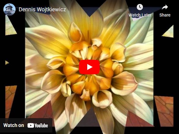

Why this video?I chose theses videos because it displays different variety of Wojtkiewicz's work beside the abstract nature. It also displays a lot of his work so you can really get an understanding of his style, technique and elements which he continuously uses in most of his work revealing which sections are intended to fit the rest of his gallery. It can also be used in context of time periods to see the evolution and changes of his work throughout his career or life as an artist.
|
"I use a Canon EOS 90D camera with a Canon EF 100mm f/2.8 Macro USM fixed lens. The only reason I even know about the technology is because my colleague told me that's what I needed and would be the biggest bang for the buck. The rest of it is all by feel. I have absolutely no photo training. For me that suffices because I'm not hung up on technical stuff. Just looking for ways to capture information for my paintings." - Dennis Wojtkiewicz Why this artist?Wojtkiewicz is a great artist to study because he has incredible composition in all of his images because of his use of backlighting and mostly at least semi-transparent subjects help portrays a vast amount of elements and principles. for example, the texture within his forms is highly prominent because they are so clear and visible within a natural pattern. He also has amazing harmony and unity between many different colours which help to blend and brighten the subject and further point out its natural form. Additionally, using colour he can create contrast between the subject and its environment or background and even within the subject itself. It also has an abstract take on symmetry because his work appears symmetrical but when you look closer it is actually unsymmetrical like any and most natural forms. All these things make his a good artist to study because its clear he knows what he wants to come out of his images and has perfected his technique to do so despite still being an artist and not a photographer.
Who is he?Dennis Wojtkiewicz is a polish artist from the US who focuses and is most known for his hyperrealisms of ,more specifically, fruit and flowers. At this time, he is 67, born in 1956, and he is involved in photography because before he makes his large scale paintings, he creates his own perfect reference image using his own camera and lighting and setting, so that he can get it exactly as he wants it with something to paint from exactly which hasn't been stolen from another artist or coming straight from his head, making his job as a painter much easier. Despite not being a trained photographer, he is able to take professional presenting photographs of his subjects using techniques such as backlighting.
Why this quote?I chose this quote because most of the time he is talking about his paintings but this zooms in on his photography which is vital to create such artwork and teaches how to emulate his photography in a way that it isn't a big ordeal because it isn't even his main for of medium, so is actually easily done if following his rules and capable of finding his perspective or just creating your own.
|


Photographic Techniques / Back Lighting Fruit

|
Backlighting is by definition, when positioning the main source of light for a photograph behind the primary subject. This means the form is lit from the back and goes through the subject which is why mainly semi translucent subjects such as limes are used so the light can actually go through making the details of the inside visible like in most examples of Wojtkiewicz's work. This technique benefits well in photography because it allows to put a spotlight, literally, on the smallest details in a subject which aren't possible to see is the dark or even that well in natural lighting. It can help emphasis the depth behind or within the subject and can create a contrast between your subject and its
|
environment or background by separating the two key parts of the image despite it being a technique based on hard lighting and the brightness.
This particular video uses multiple kinds of specialist equipment used to create back lit fruit, an obvious one being a good subject which has details inside it which you will later zoomed in on, this is why fruit or more specifically, citrus fruits are used more often when using this technique but in this video, she used a kiwi. You will also need a plain piece of glass with any kind of light underneath but preferably a more powerful one to make sure enough light really get through. In this video, she also used a ,macro lens to zoom in completely to the subject without it blurring. This isn't necessary equipment but will definitely help if you do have one. The lens can be connected to any kind of camera, that doesn't matter as much. To prop the camera up above the subject, facing down, a tripod is used. Finally, she used a manual shutter to take her pictures. This is a good idea because it avoid having movement within the image when you touch it which is especially important for close up shoots because accidental movement is very easy to create.
This particular video uses multiple kinds of specialist equipment used to create back lit fruit, an obvious one being a good subject which has details inside it which you will later zoomed in on, this is why fruit or more specifically, citrus fruits are used more often when using this technique but in this video, she used a kiwi. You will also need a plain piece of glass with any kind of light underneath but preferably a more powerful one to make sure enough light really get through. In this video, she also used a ,macro lens to zoom in completely to the subject without it blurring. This isn't necessary equipment but will definitely help if you do have one. The lens can be connected to any kind of camera, that doesn't matter as much. To prop the camera up above the subject, facing down, a tripod is used. Finally, she used a manual shutter to take her pictures. This is a good idea because it avoid having movement within the image when you touch it which is especially important for close up shoots because accidental movement is very easy to create.


|
Step 1 : Choose the right subject and cut thinly to let light through while thick enough to have visible detail.
|
Step 2 : Setting up lighting from behind or below the subject and set the subject directly Infront or on top.
|
Step 3 : Set up camera on tripod to reduce camera shake and change manual settings to suit your shoot.
|
Step 4: connect manual shutter to your camera and take your images while adjusting set up throughout.
|
Shoot Plan / Dennis Wojtkiewicz
|
My shoot is inspired by the works of Dennis Wojtkiewicz because his photography is only half of his art form but he provided dedication to how the outcome should look rather than editing it in his head as he works to emulate his photography. Despite this not being his profession, he is able to produce professional level abstract photography through simple technique. He also finds different angles of a singular fruit to get the highest detail and lighting in his photography.
I will do two versions of this shoot. The first will be in the classroom to control the lighting with the proper photography equipment. The second the will be in my kitchen because it his multiple strong ambient lights and overall is a light area. The props I'll be using will be a variety of citrus fruits such as lemons and limes with additional translucent fruits such |

|
as kiwi or apple. These fruits should be thinly cut to allow the most light in as possible while also having enough of the fruit to provide a detailed focus. In my classroom shoot the fruit will be help on a pane of glass held up by two chairs. There will be a flat, strong light directly underneath and the camera will be held up on a tripod, with a remote release cable attached to the camera to create less camera movement. At my home shoot it will be help up between to chairs on the glass of a picture frame with a bedside lamp underneath, held closer with book stacked underneath.
For both shoots the lighting will be a mix of ambient lighting from the room and backlighting from underneath the fruit. Depending on the weather on the days, there will also be natural light coming on from the window.
In the classroom I'll be using a DSLR camera with a macro lens held onto a tripod but at my home shoot i will be using my DSLR camera with my normal 18-55mm kit lens held up by me steadily. The camera setting for both of my shoots will have a low ISO to increase quality outcome of the images and an aperture of f/8-f/12. Because the camera in the classroom shoot will be held up by a tripod it can have a slower shutter speed, whereas, in my home shoot, I will need a faster shutter speed to reduce camera shake or movement within the final image. Especially because they are zoomed in images which are trying to focus on detail, if there were camera shake, it would be much more prominent.
Contact Sheets / Denis Wojtkiewicz
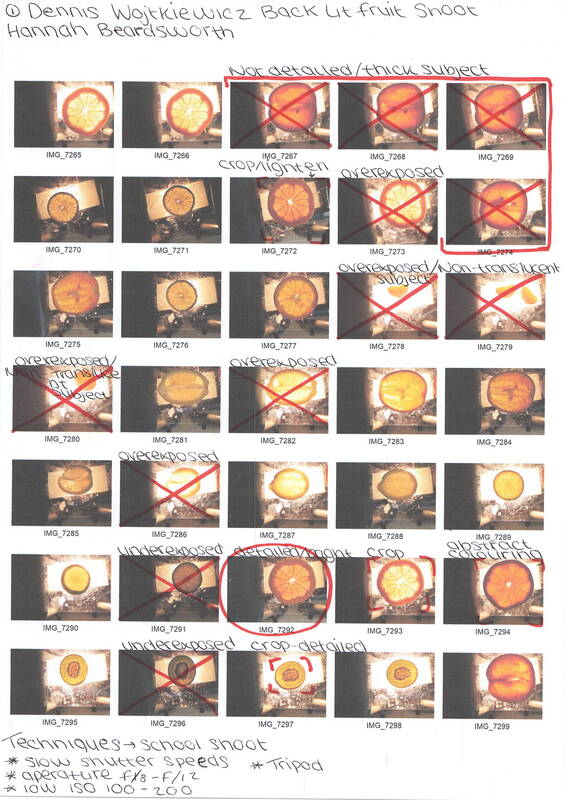
|

|

|

|
Post Editing / Denis Wojtkiewicz

Editing Step 1: Here, I have used adjustment tools on Pixlr E such as temperature and tint, hue and saturation, vibrance, and brightness and contrast to make the subject brighter and clearer to portray more of its deeper texture and detail while enhancing the colour and contrast of its natural form. I focus on brightening the skin of the fruit which I thought originally drained the image of its colour distracting from the centre.
|

Editing Step 2: Next, I carefully used the lasso tool on magnetic mode to carve around the fruit and went on select, then invert selection to select only background which I then deleted. To create the white background, I added a new layer underneath the fruit and used the fill tool to completely turn it white. The I touched up the lasso, filling in the outlying sections from the original background white.
|

Editing Step 3: After that, I unlocked the layer with my fruit on so that I could duplicate it to arrange into an irregular pattern. I was able to rotate the fruit and flip horizontal or vertical to contort it into a pattern in which each fruit didn't look identical. I tried to also add equal amount of distance between each fruit so that it wasn't cramped within the space, while helping to further the contrast how the colours I later changed some of my forms.
|

Editing Step 4: Finally, I selected 3 random fruit within my pattern to turn black and white creating a contrast and emphasising the colour of my actual fruit. I did this using the adjustment auto black and white. Then I chose two random fruit to change a contrasting colour. I did this using the hue and saturation adjustment and chose colours which I thought would stand out and compliment the original fruit.
|
Rotational Designs / Denis Wojtkiewicz
Using rotational symmetry and the works of Horst P. Horst, I have created a series of rotational designs using abstract elements such as colour, shape, tone, form, repetition and harmony. I will further develop these using Pixlr E.


Abstract Nature / Hand Manipulation Sample Boards


Abstract Nature / Art Evaluation
Throughout this project I have developed my understanding of abstract photography by exploring the theme of nature. This looks at different interpretations of how to display the simple subject of nature in a unique way revealing and creating an interesting insight into the mundane. Abstract nature is a may for photographers to create something new out of what we see so regularly by changing physically or through editing, so that it isn't recognisable as its original form. This is a lose term and can be, and has been, interpreted in many different ways, as shown by the different techniques and approaches to this term throughout my exploration of abstract nature. I did research on a variety of techniques, genres and artists of abstract photography which helped me to further my knowledge as we went through the project. To start our project, we investigated into ways to abstract an image digitally or physically. This was by using monochromatic filters, introducing depth of field by experimenting with shallow depth of field, and creating intentional camera movement to blur and mix the colours within an image and make it less recognisable to its original form (abstract). Here, we could also discover how to use the tools of our camera: ISO, aperture and shutter speed. This helped me further on in the project to more swiftly prepare for a shoot and experiment correctly rather than guessing. However, trial and error is always a good idea during a shoot to make sure that you do get the best setting available for your shoot. We were taught of different compositions (restful or dynamic) and unique approaches for viewpoint such as direct approach or flat lay better known as aerial. This helped me further my understanding of the abstraction needed for this project which I tested on my subjects from nature.
For each of my shoots i used a variety of equipment. However, for all of my shoots is used my 4000 DSLR camera with either my 18-55mm lens, a prime lens or a macro lens for closer up images. Although this could also be done by turning the original lens around, held onto the camera by a reverse ring, by using the other end of the lens, you are able to get closer to the image as you could using a macro lens. Another helpful piece of equipment was the shutter release cable. This meant that I could take the image rather by pressing a button detached from the main body of the camera as the original manual butter on the camera. This helps to avoid camera movement. This also can be replaced but by a timer which delays the time between pressing the shutter release button and the actual photo being taken. So you are able to step away from the camera and adjust things with your hands to fit the picture, right before the image is capture. Also helping to avoid camera movement from the pressing of the button which could also be done by holding either or both the subject and camera on a transverse tripod in front of a backdrop to control the background. For the lighting I used kit such as soft and light boxes while also lighting the subject from different angles, more recently during my Dennis Wojtkiewicz work, back lighting. Finally for editing, my main platform for editing tools was Pixlr E which I have gotten to know well. I did also try using the website Photofunia to display my Karl Blossfeldt overlays. Then all of my work was uploaded onto Weebly.
Initially I researched the work of Edward Weston, a 20th century photographer who I was inspired to study because of his abstract approach to ordinary objects such as his famous disfigured peppers. His work inspired me because it alters my modern perspective on photography and its techniques when there wasn't such technology to help improve and alter the product, which reflects how truly gifted Weston was in his photography that despite his challenges and the low popularisation of actual, professional photography which is visible and displayed from a young age, he was able to create something new and perfected. Additionally, even his need for perfection proves how he didn't just want to take a picture of anything and wow people singularly because of the amazement of a new art form but rather because his work impressed and intrigued viewers of then and now but rather found subjects with interest to him personally such as his abstract peppers, however he did also do images of landscapes and natural beauty in nature, unabstracted. Through studying this artist, I was able to explore concepts of line, shape and harmony in my own photography examples. Weston specifically used colour and shape to zoom in on aspects of his subjects which may be unseen by physically highlighting them with a light held to display a specific section of texture or pattern within the subject. He was also able to use line to direct the viewers eyes to whichever section was of peak interest from his perspective. However, the lines can also lead to sections which he intents to ignore, giving viewers the freedom of their own perspective and interpretation. The element of colour is the most important element used in his art because by using the grey scale he takes away the bright colour that is usually the main distracting factor of the form in which he chooses (vegetables), so by removing it he conveys what he wants you to see and builds contrast against the darkest and lightest sections, illuminating interest within the forms. Another primary element in Weston's work is shape. By allowing the subject little space within the frame, it can further direct the viewers eye but more importantly, by having extremely dark backgrounds, he can also lead to less distraction within the background, create contrast between the subject and it background, and form dark lining within the background to direct the eyes to the form, utilising the many elements to portray and control his work. Through studying this artist, I created a series of emulations by choosing an array of my own fruit and vegetables which I left out for a short period to decay to truly catch the feel of Weston's work. I investigated the technical process of low key photography which uses dark coloured scenes to highlight a contrasting form between the subject and its environment or even within the subject itself. We used plant pots to let a little amount of light in from the background, while using the natural light from the window to illuminate the front of the form. This worked quite well however I found that it was difficult to get light deep into the texture rather than the surface with the weak light. We also did another shoot emulating Weston's work using black screens of paper at the sides and beneath the subject, while shining a strong light onto it. This worked much better because we had more control over the texture which would show up on our final images and could viewer different angles of the subject while keeping a darker environment. However, this created shadows on the wall which disturbed the background. Furthermore, the corners where each piece of paper met were visible in my final images, lighting up the background and the entire image making it not as dark as I wished for it to be, lowering the contrast. Finally, I did another shoot at home in which I used a thicker plant pot which I scratched at the bottom to specifically emulate Weston's Pepper No.30, and multiple torches. This created a darker environment and highlighted the texture on my subject making this my favourite shoot. However, the pictures ended up being quite dark, but they were still my favourites of my final images because of their sharp emulation to Weston's. Their work helped me understand the theme of abstract nature by highlighting texture of the subject rather than using colour to abstract and change it from its original form digitally or using further techniques in which I studied later in this project. Additionally, he doesn't actually abstract the real form of his subject but rather portrays the natural decomposition and abstraction of living things which was unique and new at the time. It helps me to understand the different ways and techniques in which to abstract a form rather than the initial ones in which I knew of before investigating Weston's work.
To follow this, I investigated and researched the works of Anna Atkins. I was inspired by her wok because it is photography created before the use of cameras but rather by using solution and exposure with negatives to replicate the outer detail and patterns onto a separate piece of paper which is called a cyanotype. These were for use in textbooks and picture books more specifically, botanical books containing cyanotypes of different plants and florals. This inspires me to test ways to abstract my photography without the use of a digital camera or editing and teaches me how photographers before me in history created and portrayed their new art. Through studying this artist, I was able to explore concepts of line, shape and harmony in my own photography. Atkins displays pattern and tone in her work to be able to portray more detailed and accurate copies of her treasures and when clear, they can replicate a striking reality to the actual form by outlining the pattern of its external and, if translucent enough, the texture of its inside. The element of tone also helps to do this by demonstrating the change in thickness throughout the form by how much light it will let through. This furthers the accuracy of her final outcome, making it a more reliable source of photography in that time period. Inspired by their work, I
created a series of emulations by covering some small pieces of paper in the solution in which Atkins would have used, which made it appear blue throughout. Then I put my small subjects onto the paper and clamped it onto a piece of glass to keep it sturdy and avoid blur from movement. After that, it was left to expose in a light box leaving a dark blue, final copy. This wasn't effective because despite me trying my best to clamp it down, it moved during the process and most of my images ended up blurry which was quite disappointing but proved the difficulty of having to use the technique. I investigated the techniques process of creating cyanotypes and I can learn from the mistakes if I later want to replicate this technique and build in this skill. Their work helped me to understand the theme of abstract nature by teaching me how to create an image without the actual use of a camera which is inspiring the amount of patients and professionalism that photographers at the time such as Atkins mut have had.
I then explored a similar artist to Atkins called Man Ray. I was inspired by his work because, like cyanotypes, he creates copies of objects or negatives which were rather called renograms, named after himself. This is a more advanced version as you could scan in the actual objects to create a renogram or scan the subjects physically using light sensitive paper, and they were produced in black and white, rather than coloured. It turned where there was light in the image dark, meaning the texture of the initial image could be portrayed onto the rayogram. This helped me to explore the concepts of line, shape and harmony in my own photography in the same way in which Atkins works did as the technique is very similar and the final outcome presents the same elements but rather a more modern version through a shadowy image. Inspired by their work, I created an emulation of one of my Weston images to go along side my cyanotypes. This was created through editing my image on Pixlr E to completely black and white with a large amount of contrast. Then it was printed onto acetate, a clear kind of paper which when I printed onto it, just produced the darkest sections of my edit. This went quite well as the image chosen for my work was quite detailed in texture and although abstract its easy to understand its initial form as it keeps its shape nicely. I investigated the technique of rayogram's and it was much easier and reliable than that of cyanotypes however still not as much of a modern approach as could be. Their work helped me to understand the theme of abstract nature as another way of abstractly producing your art which could have been used in history and very easily accessible now especially for high texture and pattern images. Although our images weren't as alike to Man Ray I still find his art style very modern and interesting especially because of his odd subjects in which he chooses to zoom in on such as light bulbs and house hold objects.
We then briefly explored the works of Horst P. Horst. I was inspired to do this because it presents a digital technique to display your work after the photography which strong abstracts the initial form from its original subject. I also like how the same technique can be used in different ways at different angles to create unique forms of the same image, allowing you to test and experiment with your work. He is inspiring because despite the value of the original image needed to rotate, it is distorted to unrecognisable through the rotation and movement of angles. This also makes the patterns more of a focal point than the actual image used. However, the photography of Horst P. Horst is still professional and thought out for the works of its later editing. Through studying this artist, I was able to explore concepts of line, shape and balance in my own photography examples. By rotating images, lines and patterns are created to help mirror the image in a way which is recognisable as a reflection. Inspired by their work, I created a series of emulations by taking nine of my Edward Weston vegetable images and nine of my Anna Atkins inspired cyanotypes and reflecting them in different ways to create different patterns of contrast and line which were again used later in my project. I investigated the technique process of rotational symmetry in which I digitally copy the same image and mirror through reflection and rotation to create a symmetrical pattern much as the works of Horst P. Horst. Their work helped me to further understand the theme of abstract nature by teaching me how to edit in element to my natural forms and that I should find elements such as line and pattern within y final images to create further elements within a rotation. This also helps to abstract even a singularly regular natural form rather ones like my emulations which I have already abstracted.
After that, I did in depth research on the work of Karl Blossfeldt as a contrast to my initial research of Edward Weston. I was inspired to emulate his work because it was an entirely new approach to an actual technique of creating abstract forms. He rather used a large amount of lighting and brightness to highlight the entire subject and its texture rather than a specific focal point. Additionally, the uses of sepia tones, greys and whites makes the image a happy and bright one whilst always being able to contain contrast to further accentuate the elements within his photography. As a photographer, he is inspirational in his unique technique and proof of testing and editing of that specific technique to create a perfect outcome down the line in his career, proof of his dedication and true love to his work. His work is created using an extreme amount of light on either a partially translucent or solid subject to either create contrast or texture beneath the surface of the subject. Through studying this artist, I was able to explore concepts of shape, form and unity. Shape and form are presented through the emphasis of dimension created by the large amount of light. This can be seen on a solid, contrasting subject by the visible texture, outlining the shape of the actual form. However, this hyper visibility of its texture abstracts the forms because they are never usually seen in such close up view and even if you tried, the eye wouldn't be able to pick up as much which is visible in Blossfeldts presentation of the subjects, due to the lighting. In subjects which are partially translucent, there is a high sense of unity within the image like in many of Blossfeltds works containing white flowers. The unity between the pure white background and the sharply textured subject is satisfying to the eye. To further this unity, his work is put into sepia tones which connects the subject and its environment subtly, whilst creating a bright for of contrast rather than the usual black and white which would ruin the high key technique used on his work. Inspired by their work, I created a series of emulation by having three set ups containing changing directions and concentrations of light. The first was set up with a white backdrop with lights directed from the left and the right. The camera was held on a tripod, as was the subject. This was quite difficult because it wasn't the brightest set up, so didn't let in a lot of light. Additionally, because of this, a lot had a dark yellow tone which I did like the outcome of but wasn't the aim while emulating Blossfeldt's work. Furthermore, because the subjects were held on blue tack, some had to be awkwardly edited to
remove it. The second set up was the best set up. It contained a white Perspex diffuser with a remote light behind and two lights angling in front. This allowed the most amount of light in, revealing the most texture producing my favourite images which are striking close to the work of Karl Blossfeldt's. Finally, we did aerial shoots onto a white piece of paper. These were the least successful because the paper wasn't extremely wite which meant I had to thoroughly edit later to make it match my other images. Additionally in some images there is a shadow created and again with the sepia tones it takes away from the bright white of the technique. During the editing process I found many of my images to be too dark however when I increased the brightness of the overall image, the subject is distorted and fades into the background. Furthermore. because I used mainly floral subjects, I wasn't able to only select the background to edit because the subject didn't appear entirely attached and was presented to fade into the background. I investigated the technical process of high key photography which overexposes the subject which makes every part of texture visible by getting light through even the thickest parts of a subject with a powerful enough light. Their work helped me understand the theme of abstract nature by contrasting most of the work I've already done into abstracting nature, furthering my knowledge of the techniques of this project. Additionally, this is the best technique and display of which highlights fully the texture of the subject in the best way while also having the ability to create subtle contrast.
Finally, I researched the work of Dennis Wojtkiewicz who I was inspired by because of his immense amount of detail which he is able to capture within his photography despite it only being a minor part of his overall work since he is an artist rather than a photographer, so his images are only reference photos but he still can produce professional abstract images because of his dedication to the entire process of his art form , which is inspiring. Through studying this artist, I was able to explore concepts of shape, form and colour. Shape is produced through the different angles at which he takes his pictures. Some are of half of a fruit, zooming in on a specific section with varying textures. Others are taken with the whole sphere, creating the shape within the image. Its within the spheres that the element of form is easily seen to demonstrate natural light hitting sections of the subject and shadowing which reinforces it dimension as an object. Colour is a very noticeable part of Wojtkiewicz's as he uses multiple complementing colours which align with the natural state of the form and contrast it. This can also help make the texture more noticeable by highlighting or hiding sections. Inspired by their work, I created a series of emulations by choosing a variety of translucent fruits such as grapefruits, oranges and kiwis. I then backlit them by propping them on a piece of glass between two chairs and putting a light underneath. I did two shoots, but both were done this way however the first light was more powerful than the second, so more successful. This was done to amplify the detail of texture which can be seen so it could be helpful for later editing and because the only focus of the images were the subjects. These images were used for my mock exam and to prepare, I edited my favourite subjects out and made patterns behind a white background then overlayed them along with my rotational images from Edward Weston, to create a final piece which I would collage. During this shoot, I investigated the technical process of Backlighting, lighting my fruit from the bottom so not to under or overexpose while letting enough light through to display elements of texture and form. Their work helped me understand the theme of abstract nature by focusing entirely on the subject and abstracting it completely through editing, the most which i have every abstracted my work, through overlaying and changing colours to contrast and compliment. It also teaches me more about the broad term of nature, being anything away from civilisation, even citrus fruit.
I think that my most successful shoot was my Karl Blossfeldt shoot because although a lot of them couldn't exactly replicate the works of Blossfeldt because of a lack of light, I had a few which I absolutely loved because of their striking resemblance from its texture and complementing of colour between subject and background. The composition in regard to framing made sure that each subject was centred with the rule of thirds which allowed space between the subject and its environment to create a contrast while keeping the subject and its texture or pattern as the centre focus. This also brings the texture closer to the viewer, making it easily viewable, increasing the clarity of the overall image. For this specific shoot there were no leading lines necessary since the point of high key is to illuminate every part of the subject. My favourite images were taken using the most lighting, in the shoot with light directing from in front and behind to completely overexpose the subject and show all of its texture. However, because of the sepia tones, a contrast can still be created but only slightly which allows the image to still be extremely bright but the contrast visible. In most my images the contrast is between the outline of of the subject and the most. Except on full, solid, dark subjects like twigs. This creates sharp contrast between the darkness of the subject and white environment. Furthermore, since both subject and environment are effected by the sepia filter, the contrast isn't increased or decreased. The viewpoints of my images were simple for abstract photography but allowed me to contain the most light within my image without causing a shadow or dark spots wince the lights would have to move with the camera. Additionally, to replicate the works of Karl Blossfeldt it should be taken from straight on, as all of his work does. So, although its doesn't display a creative vantage point it helped me to properly emulate what Blossfeldt decided as an interesting perspective. Although I was able to experiment with different angle through my aerial shoot where I could make my frame busier or more quite through distance and easy placement with the shoot being on the floor rather than the subject being held up. Due to my lighting difficulties, it was best to post edit my images on Pixlr E to enhance the white light contained in the image. I did this by selecting the background and setting it completely white. This was easily done with the solid, dark subjects, however, I saw some challenges with this. A lot of my images were of flowers, so I was unable to only select the background because the contrast between the flower and background was so weak. Additionally, there were small sections between each flower which we extremely difficult to edit. To overcome these, I just edited the entire image to the best I could without blending the subject and its background together. Another challenge in editing was that for some of the images, I preferred the dark, sepia background which contrasted the white floral subjects . However, I had to edit them to make it more aligned to Blossfeldt's work. It were these images where I couldn't lighten the ensure image because of the contrast, so the subject would just disappear. I solved this by trying my best to mix lighting the image and increasing the contrast. I also used the vignette tool to brighten the sides of the images so there would be some part of the image
would be bright enough to lower the contrast even slightly. My subject matter I chose to further replicate the photographer I was studying, Karl Blossfeldt. So I chose mainly white flowers and small woodland bits like twigs and leaves. During my aerial shoot, I experimented with shells and more seaside treasures but later chose they weren't really my favourite since they distance from Blossfeldt's style and don't create enough contrast or compliment onto the surrounding colours. My favourite subjects where the white flowers, mainly the ones which were easily lit and are displayed further up the project on my grid of favourite Blossfeldt images. I love them specifically because they convey a lot of texture which i find beautiful and am shocked I was able accomplish that high amount of texture. However, some of my aerial shoots were over cluttered but in contrast, sone had too much space but that is easily fixable in editing though it could reduce the visibility of texture, making it blurry. During this shoot, because of the amount of light I needed to have camera setting which would let a lot of light in while not so much that the image would come out completely white and overexposed, which can be a hard thing to do, so you have to trial and error with the setting until you find one which fits the specific shoot and the specific light conditions of that set up. The setting which I used were a low ISO of 100, an average aperture of f/8 and a quick shutter speed of 1/50 as to capture the light as quickly as possible, especially when using the remote flash. Furthermore, every shoot used the sepia picture setting. Before doing my shoot, I did an artist research on Karl Blossfeldt looking at a variety of his images to give me a proper understanding of the techniques which he regularly uses and the viewpoints and perspective in which he takes on. Following that, I did a semi analysis of his famous work Acanthus Mollis. This helped me to look even deeper into a singular one of his works in which I liked. I could understand how he contained different elements into his work and how he presents the intent, meaning and rationale of his work through such elements which I was able to do quite well being detailed and clear. This helped me to approach his work but to prepare for the actual shoot I did a descriptive shoot plan of each of the three set ups for the shoot. Additionally, I drew shoot plan diagrams to go along with the shoot plans, which displays the props used and the settings of each prop.
Going forwards, I also have many areas of improvement at this stage in which I wish to overcome in my next projects. To improve my use of a camera, I should experiment more at home, with aperture, ISO and shutter speed. This is so I can more efficiently use the manual modes on my camera to specialise it to a certain shoot, to really end up with the images and effects that I want. This will also help me after my studies and would be a useful tool for whatever I move onto after school. Furthermore, to improve my photo shoots I should look into more creative types of composition by creating more leading lines or framing my work obeying or going against the rule of thirds giving the subject more or less space depending of the main focus of my photography. Furthermore, I could experiment further with the techniques in which I have lightly touched in my studying such as symmetry or depth of field. I would like to get a tripod, also, to improve my work going forward as it will help to take larger photos or of smaller things by reducing the camera movement. It will also mean I can do other things such as holding up a light or intentionally moving the subject, without also having to hold the camera and keeping my subject in centre and focus the whole time. I don't think that I need to enhance my contact sheets as I try to thoroughly edit them and always make sure to have the techniques on every sheet, even if its just repetition of a previous sheet. Another way in which I need to increase me creativity before going into a new subject, is by considering other viewpoints within society and nature itself. This could help me to understand the subjects in which I will find in my future work in photography and help me to make sure I am really producing what I believe to be the best outcome of a shoot while also being able to stand out to others. I will also be able to experiment with other subject forms in my next project which I look forward to, however, in this project I focused mainly on florals when I had the opportunity to experiment in excess on many natural forms. In reflection, I do think that I trialled a lot of natural forms in the sense that it wasn't only woodland bits such as flowers, leaves and twigs, but I also photographed fruit and vegetables which are lesser seen in photography throughout its history and now. This is why I enjoyed doing my Edward Weston and Dennis Wojtkiewicz research, because they didn't just use things which are widely seen as beautiful such as flowers. However, I do think that my flower images did come out the best because of the know sense of beauty with which flowers emit to most people today. Beyond my photography, there are also areas of improvement within digital editing skills. I have already explored, and regularly use, tools of Pixlr E such as cropping, levels contrast, exposure and other adjustments. Recently, in my work I have further explored using layers and overlays to abstract my work further which I enjoyed. However, I wish to explore layers further and also saturations of subjects and backgrounds. I should also explore more of the adjustments available on Pixlr E so I am using the best tools to improve my work a little or a lot. This will also help me by making my editing easier in the future because of the knowledge I will pick up. To improve my artist research work, I need to work on my emulations skills. This can by done by replication the background, subject, lighting. framing and perspective and singular images. This will help me to create a couple of staple emulations which really mirror some of the artist exact work. To follow from this with my new knowledge of the structure of a shoot for the artist, I can create more pastiches with a mix of my interpretation and the initial photographer I'm researching. I don't think there's any improvement in the area of my actual analysis's since they are descriptive and go through all parts of the semi analysis technique thoroughly. I also enjoy editing images to display what I am trying to convey, especially the ones which I have don't for my Edward Weston analysis. Finally, I think that the detail of my work is made sure to be in my own words, in as greatest detail as I can while fitting in the key terminology during my shoots and techniques which I learn. I make sure to check my work for obvious spelling mistakes before publishing, although it is very easy to miss a few. However, I can still put my intended meaning across with a minor spell mistake or use of a wrong word. I try my best to be concise but can find myself writing to a large extend. I do this to very clearing convey what I want the reader to truly understand. Throughout my projects, I do have to repeat myself but only so there's no need to remember every part pf what I say as I know there's a vast amount. I don't feel I waffle to much although I understand that another perspective could say that I do. Despite this, I am proud of the work in which I write and produce, so don't regret any of these mistakes I have made, but rather hope that it can help me improve for my future projects or photography after school and am excited to explore a whole new side to photography through my next project.
